Bringing design and code together
Rebuilding a legacy design system to improve consistency, accessibility, and team workflows - improving design-to-dev time by 25% and elevating UX/UI maturity across the product
Project Summary
- Role
- Senior UI/UX Designer
- Duration
- 6 months
- Team
- Designer, Product Head, Product Manager, 3 Engineers
- Platform
- Web · Enterprise fraud intelligence platform
- Tools
 Figma
Figma Storybook
- Scope
- Design tokens · MUI v5 components · Storybook documentation
- Outcome
- Improved UI consistency and brought Figma, Storybook, and MUI closer together. Reusable components, shared tokens, and clearer documentation helped speed up design and development.
Final Results
This is the final output of the redesign, both the Luna design system and the dashboard UX.
 BeforeAfter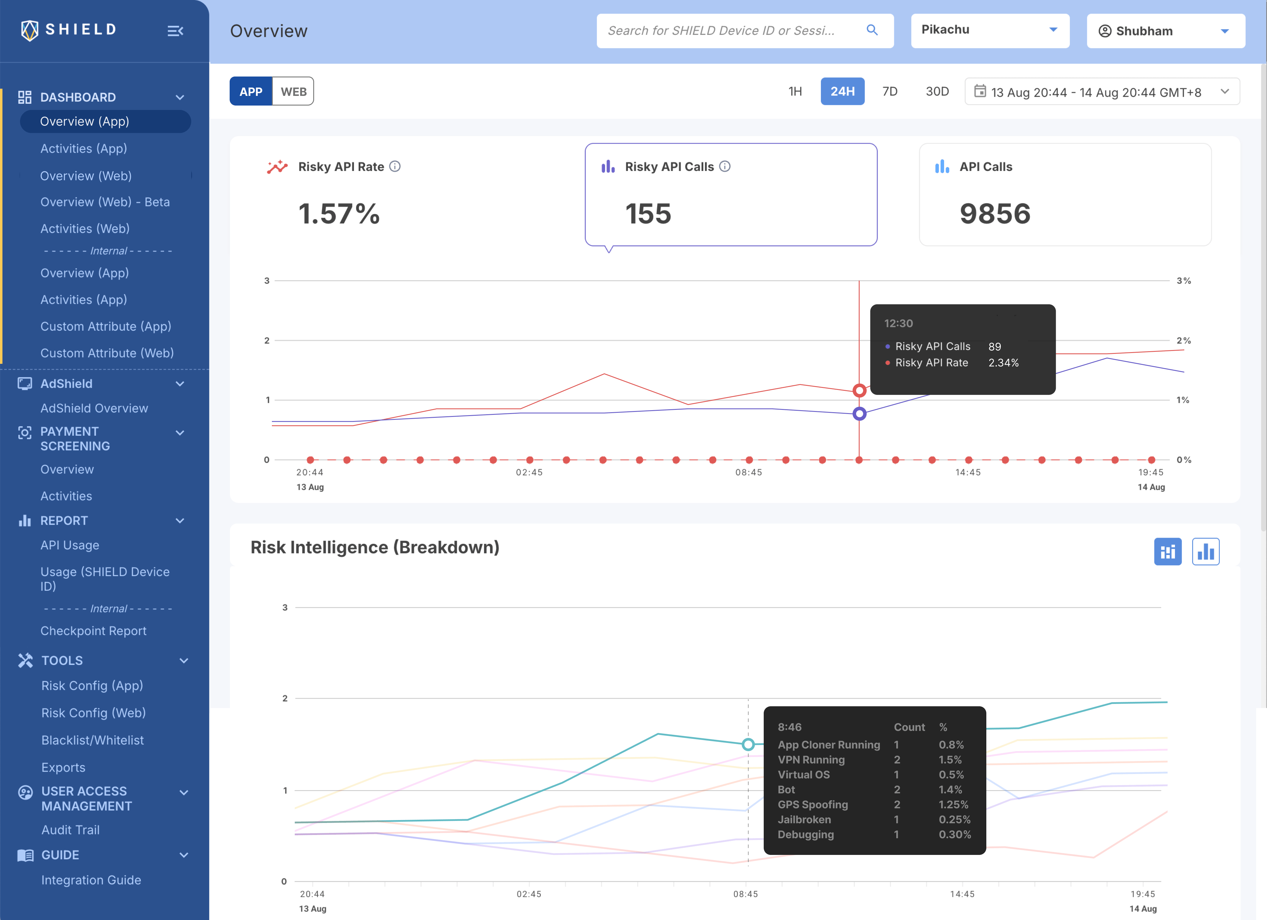
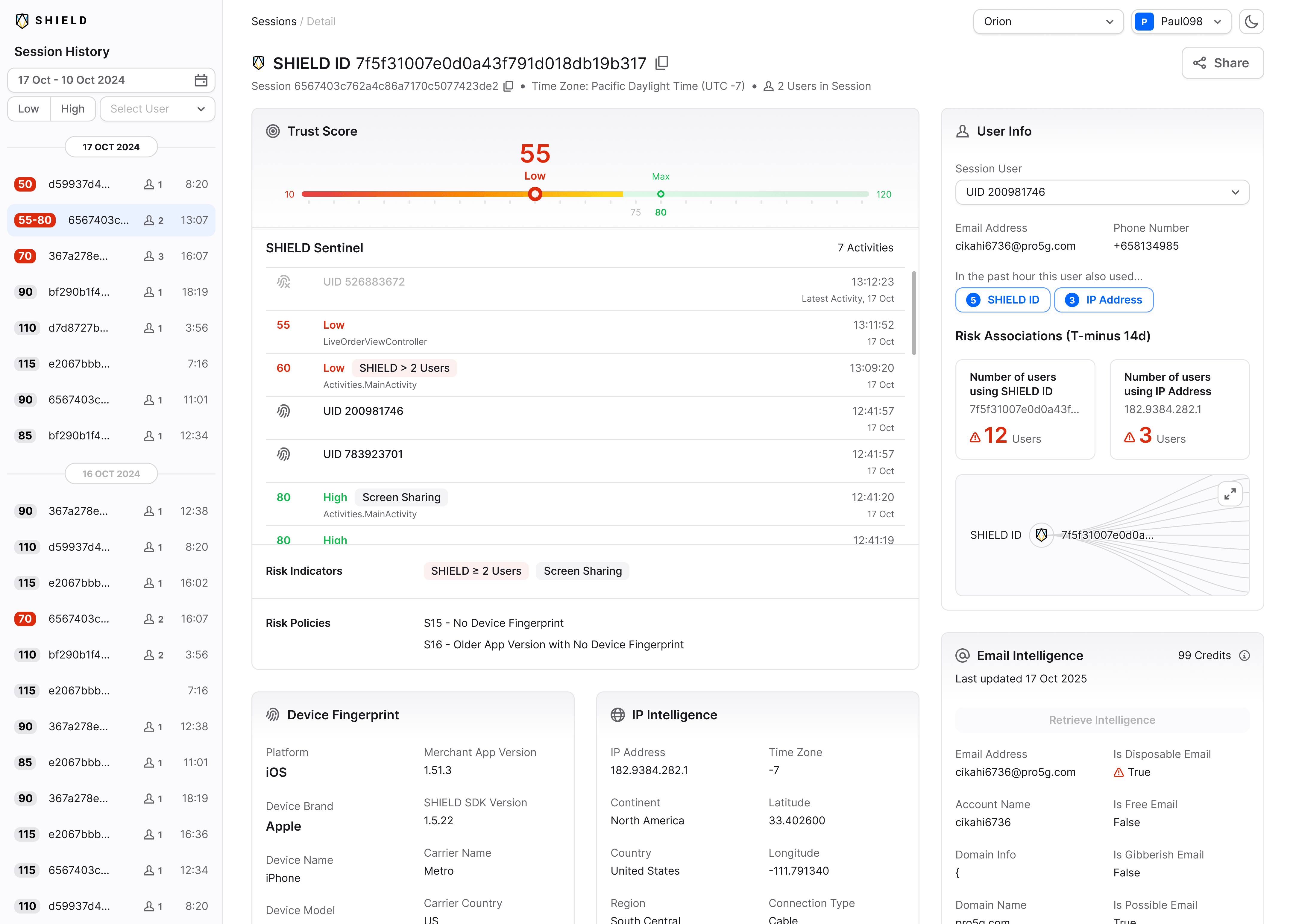 BeforeAfter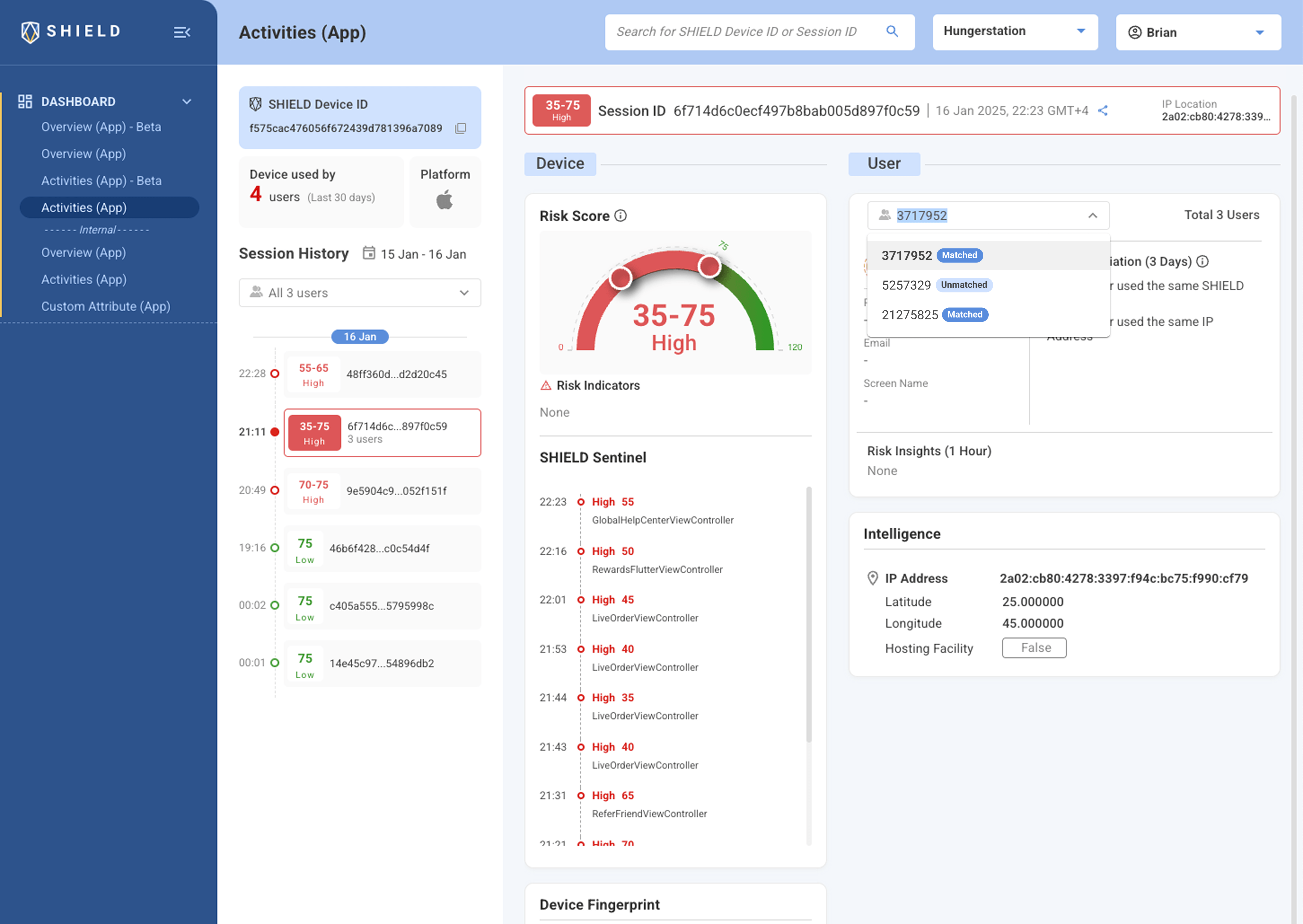
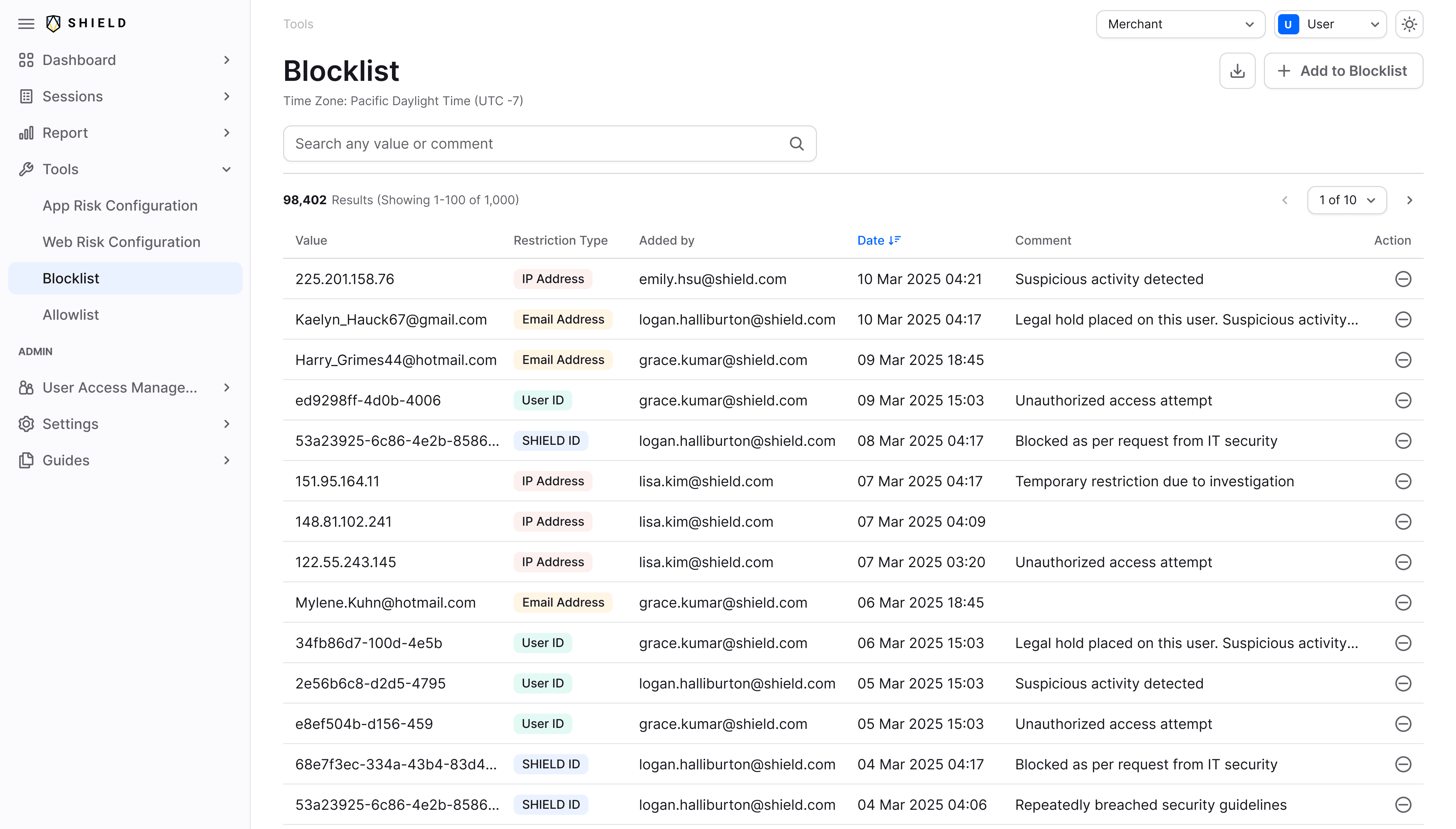 BeforeAfter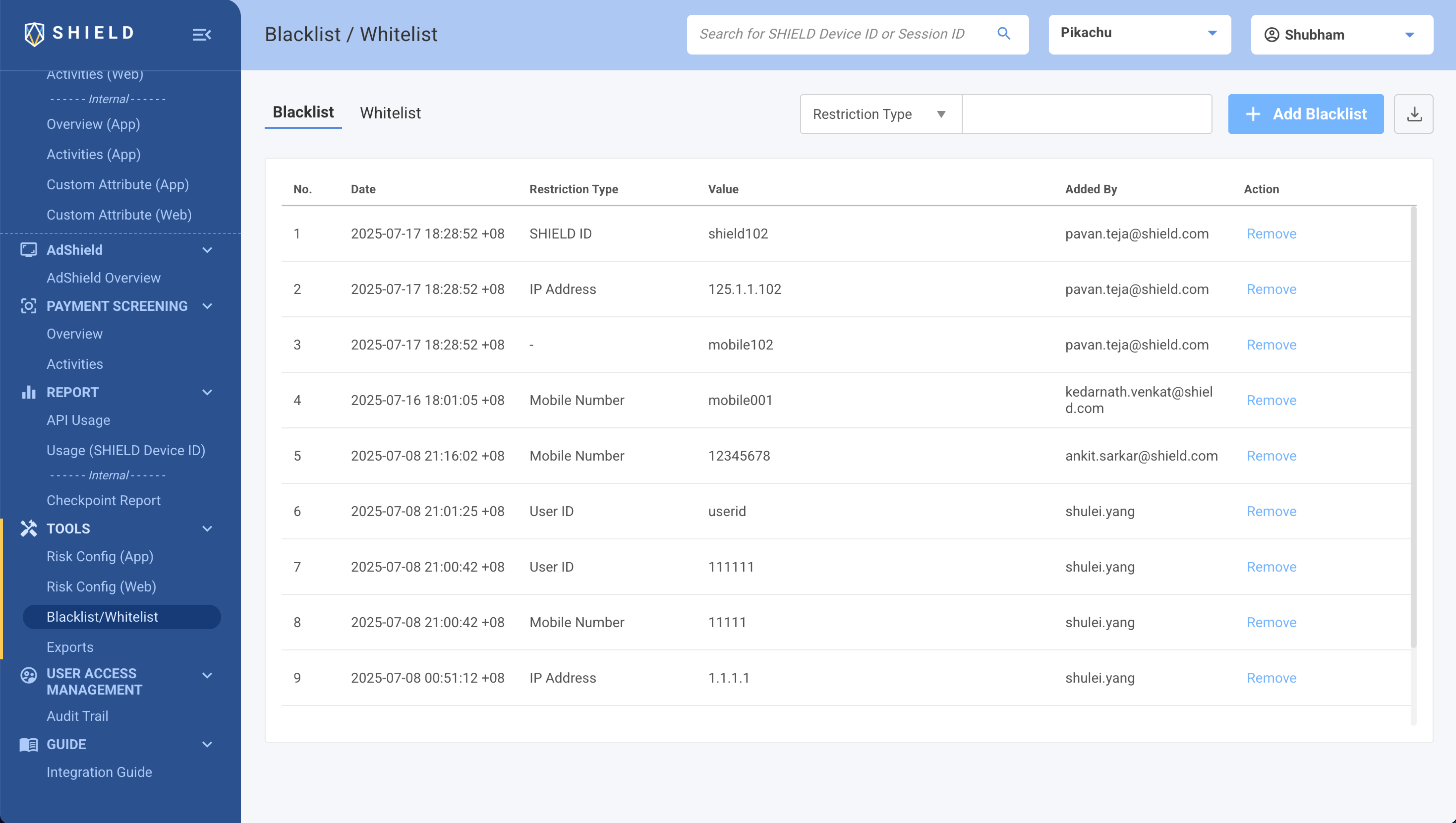
Context and problem
With over 7 billion devices profiled and 1 billion user accounts protected, SHIELD helps digital businesses detect and prevent fraud across apps and websites. Its platform uses device intelligence and real-time risk signals to identify suspicious activity and help businesses stop fraud.
Most SHIELD customers used the API to integrate fraud detection into their own products rather than using the SHIELD dashboard. Redesigning the dashboard was an opportunity to make it more useful, but we quickly ran into a problem with the existing UI foundation.
Figma and code had drifted apart. Colors, typography, and spacing were often hard-coded, and components weren't consistently maintained across the two.
The core problem: We couldn't build a better dashboard on top of a system where design and code had no shared source of truth.
My Role and Responsibilities
Leading the initiative
Identified the gaps in the existing component library and took the lead in building Luna, bringing design and code into alignment.
Building the design system
Rebuilt core components in Figma, defined variants and usage rules, and created a shared color-token system aligned with MUI v5.
Working with engineers
Collaborated with engineers to align Figma components with Storybook, review implementation gaps, and document components for consistent use across the product.
Process
I compared Figma, Storybook, and the live product, documented inconsistencies, and spoke with frontend developers to understand the gaps.
Key findings:
- Some components were reusable, while others were custom-coded for specific screens.
- Components in production were sometimes missing from Figma, and vice versa.
- Colors, typography, and spacing were often hard-coded and being used inconsistently.
- Figma and Production contained outdated, duplicated, and mismatched components.
I started with colors and typography, going through the platform to understand how many different shades and font sizes were being used. I documented the inconsistencies and looked for opportunities to reduce unnecessary variations and bring things back to a consistent set of values.
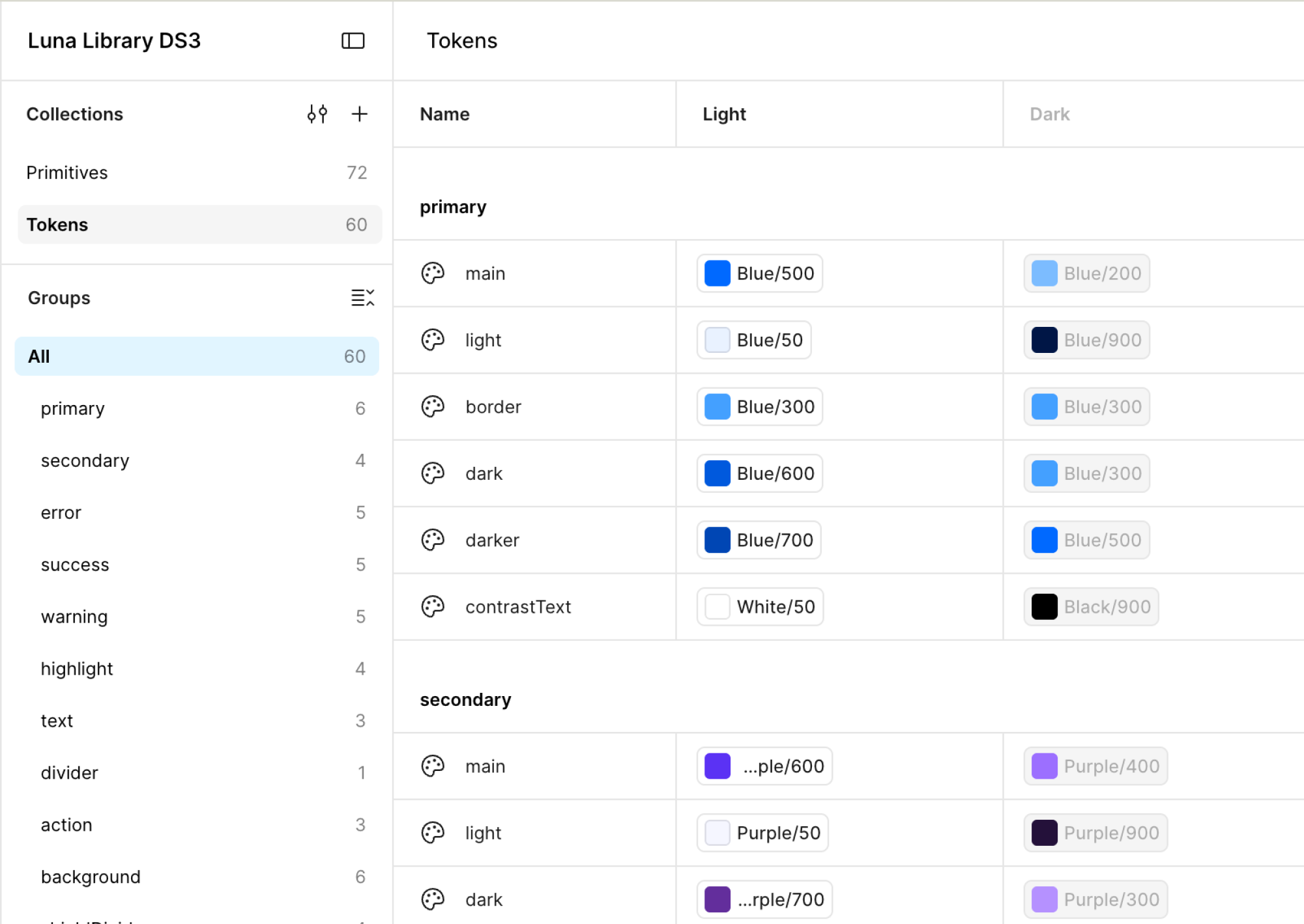
This gave me a clearer foundation for organizing our color and typography tokens in Figma and aligning them with the MUI v5 implementation.
I rebuilt core components in Figma, defining their variants, states, and usage rules. I documented how each component should be used and checked that it matched our existing MUI components.
I worked with engineers to align Figma components with Storybook and MUI, resolving gaps between design and implementation. The structured color tokens also laid the groundwork for dark mode.
Challenges Faced
Keeping things consistent during the transition
As we updated the library, old and new components coexisted for a while. Keeping Figma, Storybook, and the live product aligned took ongoing reviews and coordination with engineers.
Balancing redesign with ongoing development
We couldn't rebuild everything at once. We had to prioritize the components that mattered most while making sure the existing dashboard continued to work.
Luna in Figma
Documentation from the Luna library — colors, typography, and tokens first, then components such as buttons, chips, and interaction patterns as they were defined in Figma.
Business Impact
Faster design and development
With reusable components and clearer usage guidelines, the team spent less time resolving UI inconsistencies and more time building new experiences.
A more consistent interface
Shared color tokens and aligned components brought greater consistency across Figma, Storybook, and the live product.
A foundation for future growth
The structured system made components easier to maintain and created a starting point for future improvements, including dark mode.