Turning Complex ML Monitoring into a Clear, Actionable Experience.


Think of Spotify’s music recommendations — powerful ML models trained on mountains of listening data, predicting what you’ll love next. But tastes shift, trends change, and yesterday’s hit might be today’s skip.
Censius ensures those predictions stay relevant.
Monitoring: Detects when models drift from the latest trends before performance drops.
Explainability: Reveals why a recommendation appears, making AI decisions transparent and trustworthy.
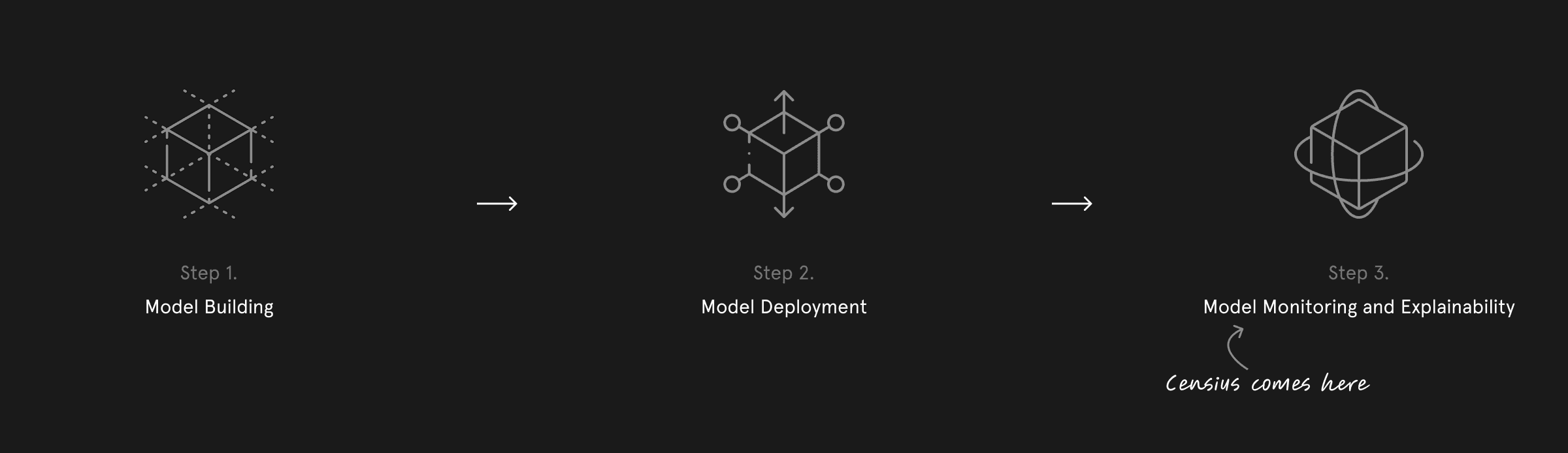
Positioned at the post-deployment stage of the ML lifecycle, Censius acts as a guardian — keeping models sharp, adaptive, and ready to deliver the personalized experiences users expect.
Role and responsibilities
Role
UI/UX Designer
Time
Jun 2021 - Dec 2022
Team
Ayush Patel (Founder), Sidharth Sahani (ML Lead), Shubham, Rahul Thakur (Front-End Lead), and three Front-End Developers.
Scope
UX Research & Analysis, UI, Prototyping & Usability Testing, Feature Ideation & Workflow Optimization.
Status
🚀 Live
I had the privilege of joining Censius as their very first product designer. It was an exhilarating challenge – I spearheaded the design efforts, laid the user experience (UX) foundation for the Censius Platform.
Understanding the user and their needs

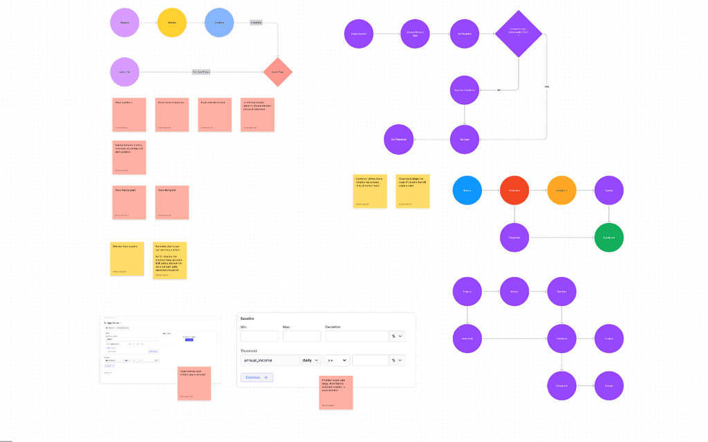

Image: Translating research into action
When we first spoke to ML engineers, data scientists, and project managers one thing became clear — they all relied on ML monitoring, but not all could use the tools built for it.
Most existing solutions felt like they were made by engineers, for engineers — text-heavy dashboards, outdated UI patterns, and cryptic workflows that left non-technical users struggling to keep up.
This gap became our opportunity. We set a clear design goal: transform a complex, engineer-centric product into an intuitive, visually engaging platform that anyone could understand and use confidently. To achieve this, we prioritized three guiding principles:
Clarity — simplifying monitor configurations, creating intuitive visualizations, and making alerts and data organization easy to interpret.
Efficiency — helping users understand model performance faster, without wading through complex workflows.
Familiarity — leveraging proven UX patterns from popular SaaS tools to minimize the learning curve for both technical and non-technical audiences.
Design Research
ML monitoring tools can be highly technical, often requiring deep engineering expertise. As a designer, I saw this as an advantage — it put me in the same position as many of our non-technical users.
To bridge this gap, I worked closely with Sidharth, who walked me through each feature’s purpose, technical flow, and value to the user. These conversations helped me translate complex functionality into intuitive UI/UX mockups that could be understood by both technical and non-technical audiences.
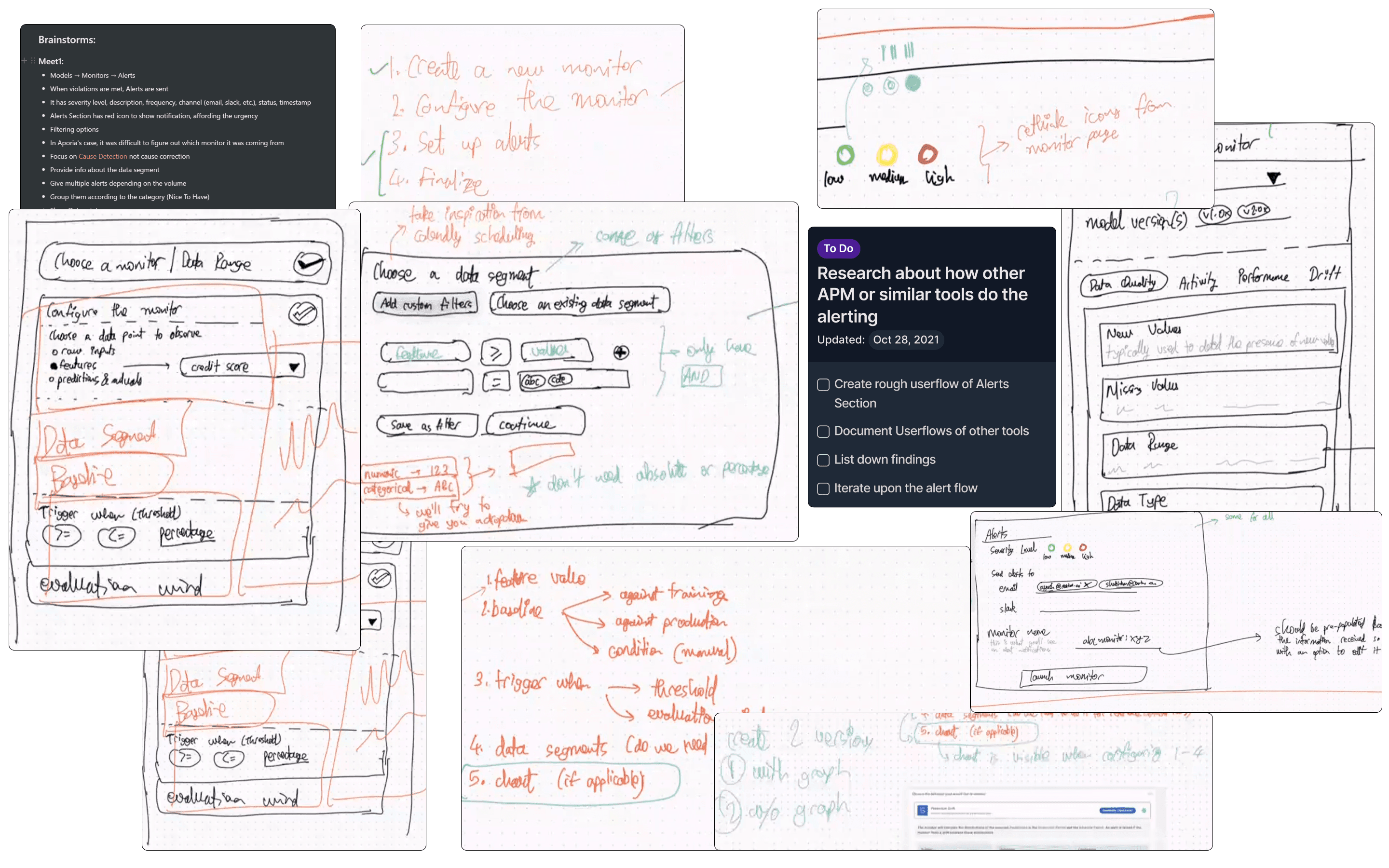
IMAGE: research notes, ideation & planning
Alongside this, I conducted a competitive review of existing ML monitoring platforms and popular SaaS tools, identifying proven interaction patterns and common pitfalls. Regular design reviews with the founder and engineering team ensured we stayed aligned on product architecture, feasibility, and usability goals — turning research insights directly into wireframes and flows.
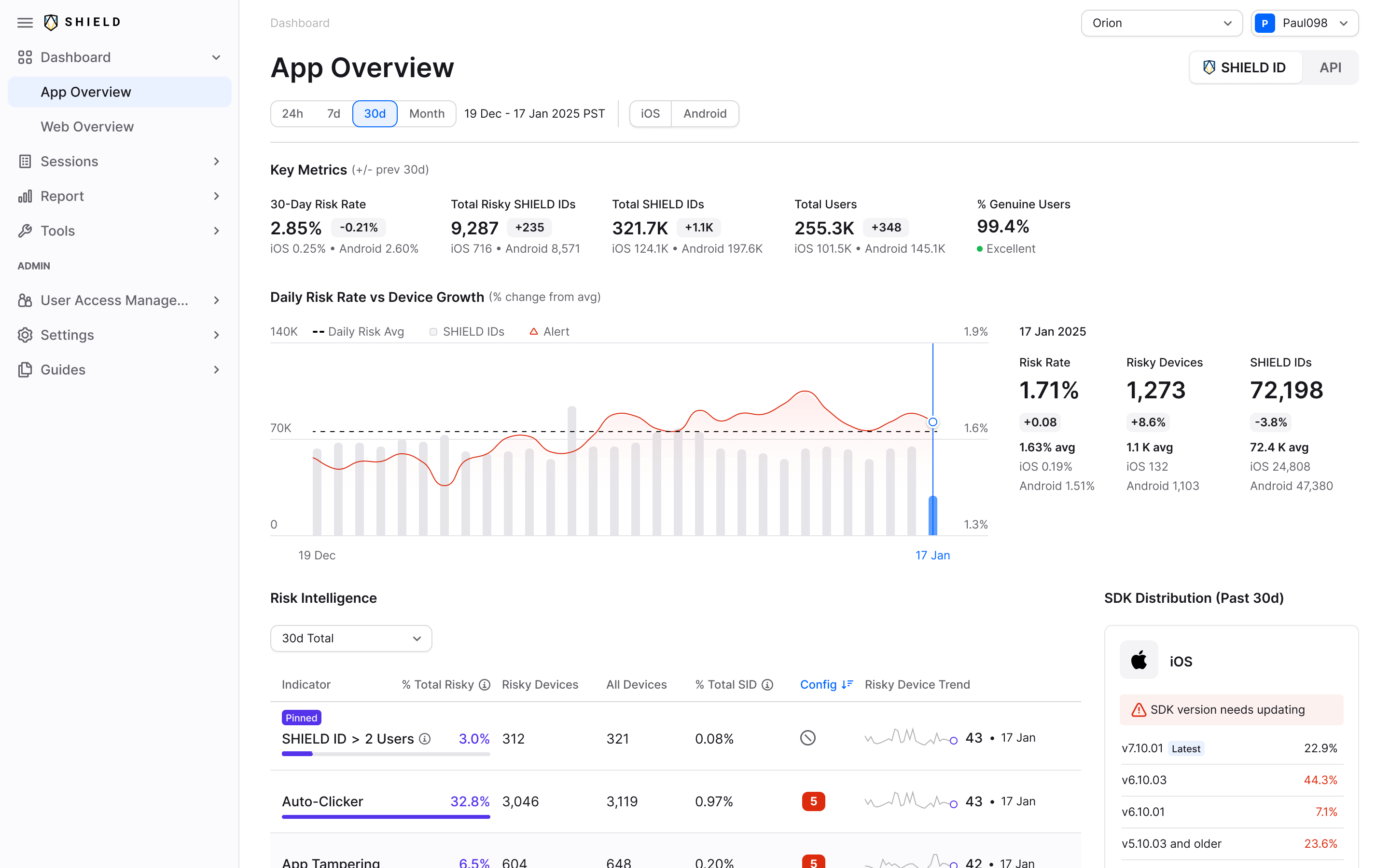
Monitoring your models
In machine learning, model monitoring works much like a smoke detector — it alerts you when something goes wrong so you can act before it affects outcomes.
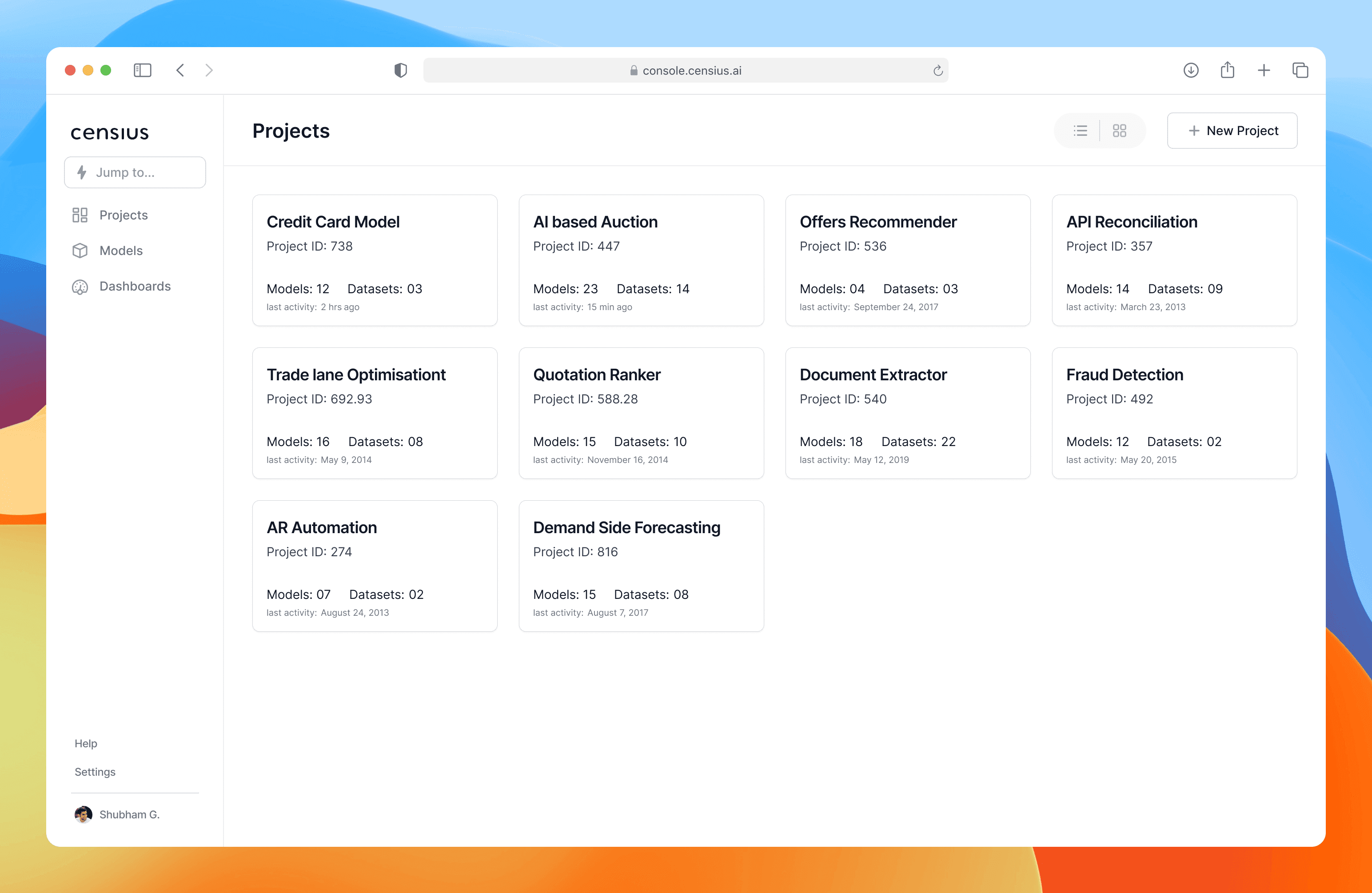
Our challenge was to make this complex process approachable. Censius groups models and datasets into single-level projects, reducing clutter and giving users a clear view of everything tied to a specific goal. For example, a bank running an “Offer Recommender” project can instantly see all related models and datasets in one place.
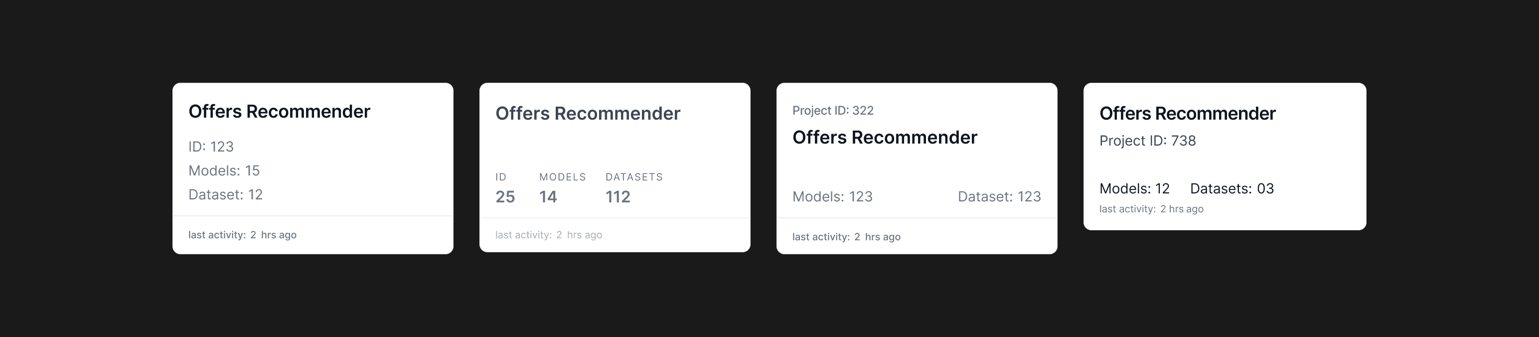
Some of the Iterations of Project Card
Each project card surfaces key details — names, models, datasets — for quick scanning.
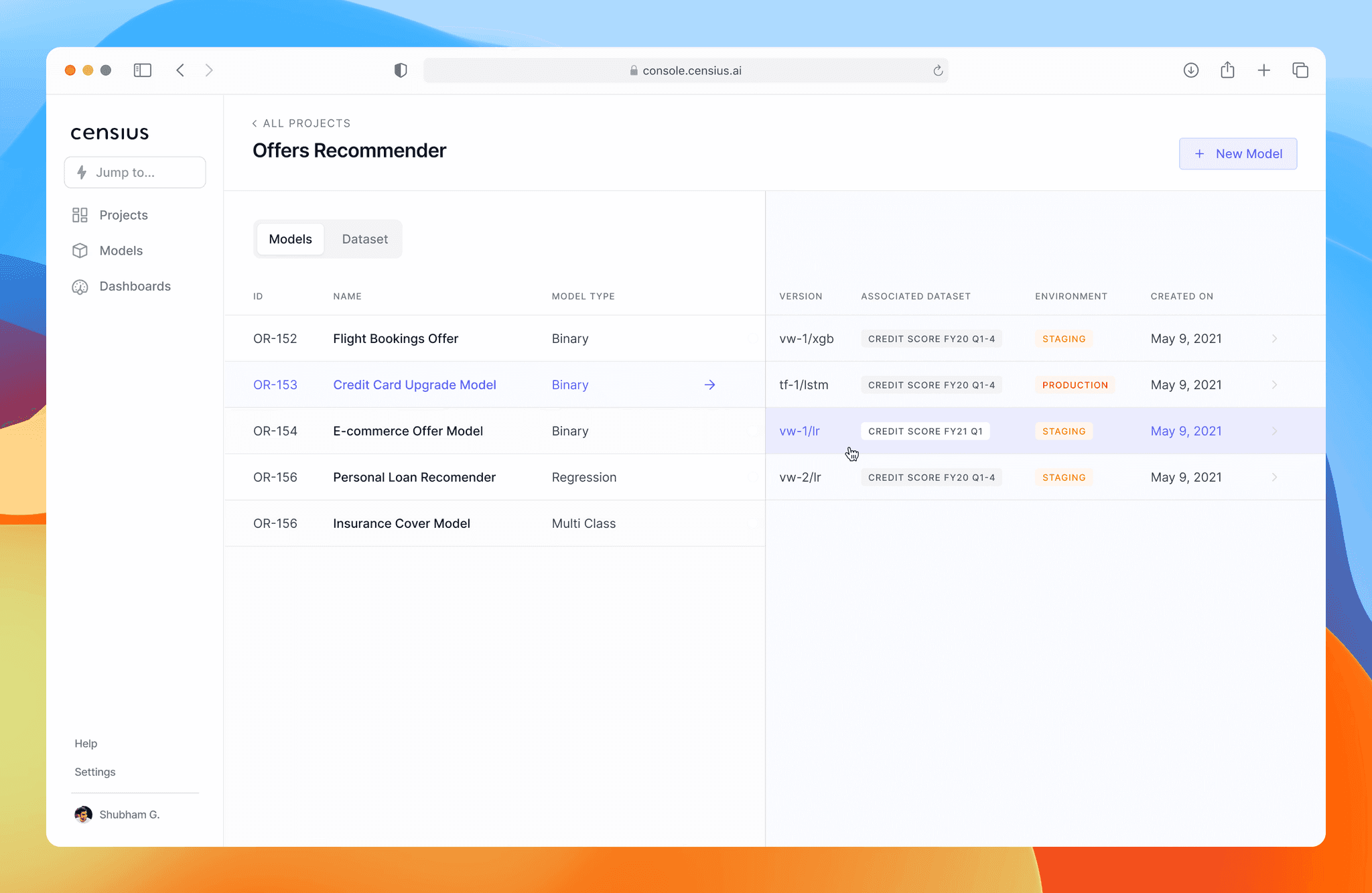
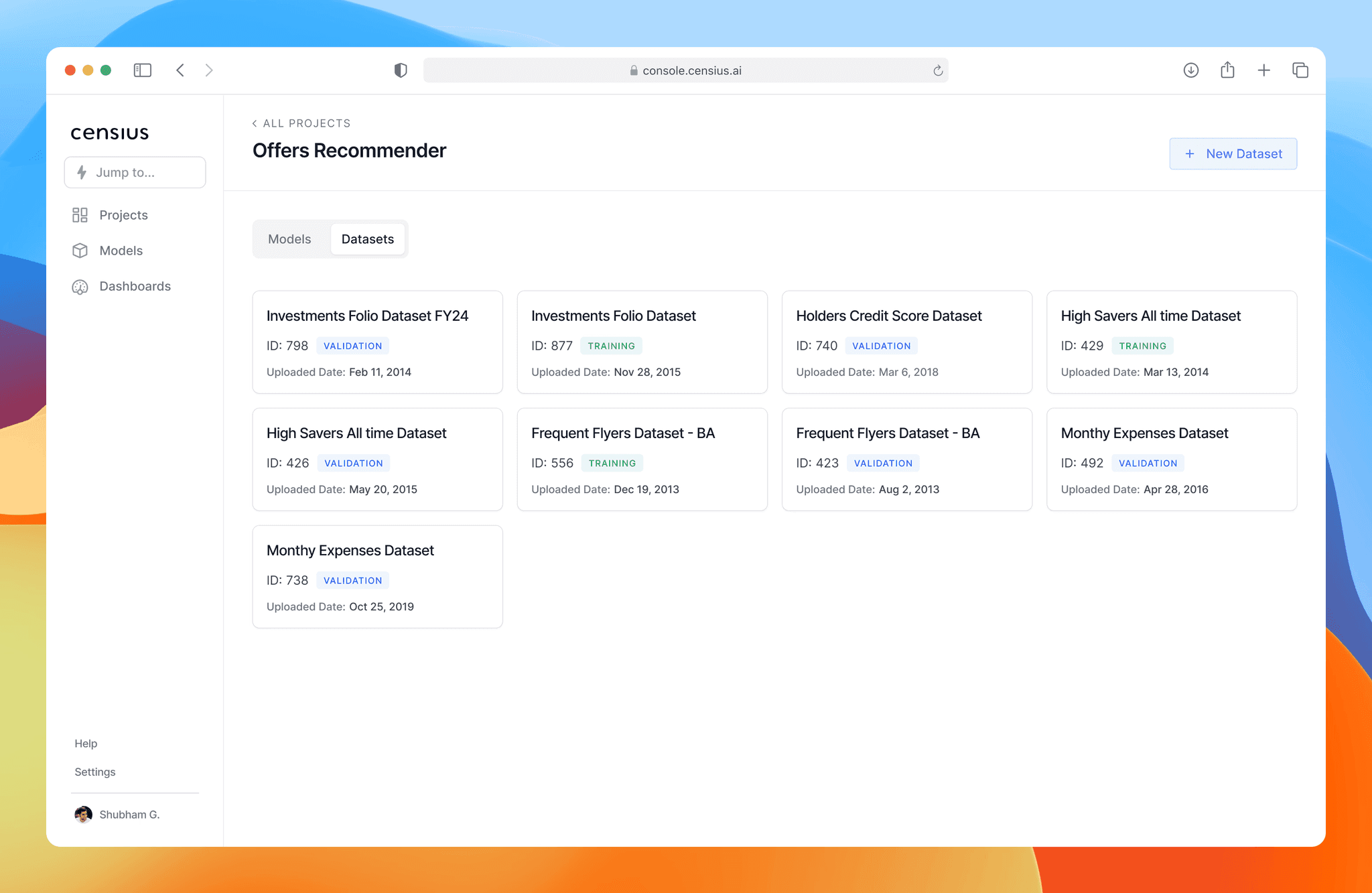
Inside each project, users can toggle between Models and Datasets via tabs, with a two-column layout for the Models view:
Left column — list of models.
Right column — versions of the selected model, with essential details in view.
I explored side sheets and pop-ups, but they hid too much context. The two-column layout kept everything visible, enabling fast comparison and navigation without extra clicks.
Model Details
The Model/Model Version Detail screen is where users analyze, investigate, and extract actionable insights about their models. The challenge was clear: how do we present a large volume of technical data in a way that’s simple to navigate, easy to understand, and supports quick decision-making?
Working closely with the team, I broke down every data point we wanted to display and began organizing them into components based on user interaction patterns. I explored multiple layout options — pop-ups, side panels, accordions, and tables — creating rough mockups for feedback. With active input from the engineering team and guided by our design principles, we landed on a layout optimized for discoverability and mental models.
Full view of Monitors, Model Performance, Dataset, Explain, Fairness, and Iterations
I implemented contextual navigation that adapts to the user’s current view — breadcrumbs, tabs, filters, tags, search within context, and a table of contents all appear when relevant. This keeps the interface uncluttered while making deeper investigation frictionless.
I started thinking in terms of components and from an user interaction perspective and started exploring wide range of layout options using pop-ups and side windows to accordions and tables and came up with rough mockup to get feedback from the team
The Monitors Tab — A Focused View
The Model Details screen in Censius allows users to analyze, investigate, and get actionable insights about their models. One of the most powerful features here is the ability to set up monitors.
A monitor is a way to track a specific data point within a model and define violation conditions. If these conditions are breached, the Censius app detects the violation and alerts the user. for eg. an engineer at HDFC Bank working on a credit card upgrade model might set up a monitor to alert them if the mean credit score drops below 650.
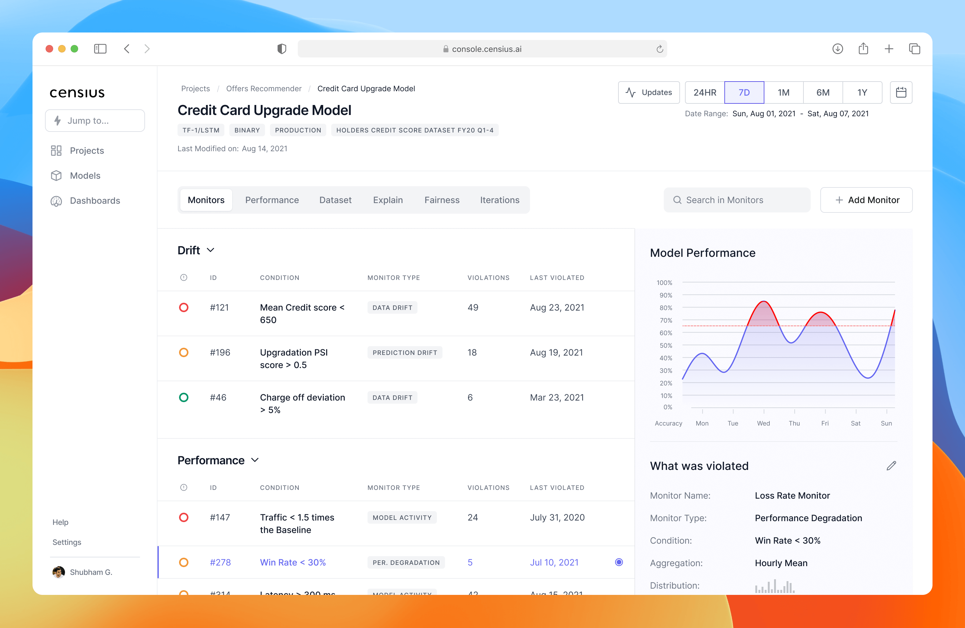
Monitors View
In the Monitors Tab, users can see all monitors associated with the current model or model version. Censius supports three types of monitors — Data Drift, Performance, and Data Quality.
The design challenge here was: how do we present a potentially huge list of monitors in a way that’s easy to scan, search, and act on without overwhelming the user?
I explored multiple layout options — from pop-ups and side panels to accordions and tables — and ultimately implemented a two-column layout with contextual navigation.
Accordions group monitors by type
A search bar lets users quickly find a specific monitor
Status indicators (red/orange/green icons) visually communicate severity of violations, so users can prioritize action

Monitor's Violation View
Each monitor type has a summary table of violations — when a data point breaches acceptable parameters. To make prioritization effortless, I added a severity indicator:
Red — multiple critical violations, immediate attention needed
Orange — moderate priority
Green — near-threshold, low priority
This visual approach allows data scientists to instantly identify and address the most pressing issues.
From Monitoring to Creation — Step 1: Create Monitor
The goal was to design the first step of the monitor creation journey, where users enter basic information: model, model version, monitor type, and the feature to track.
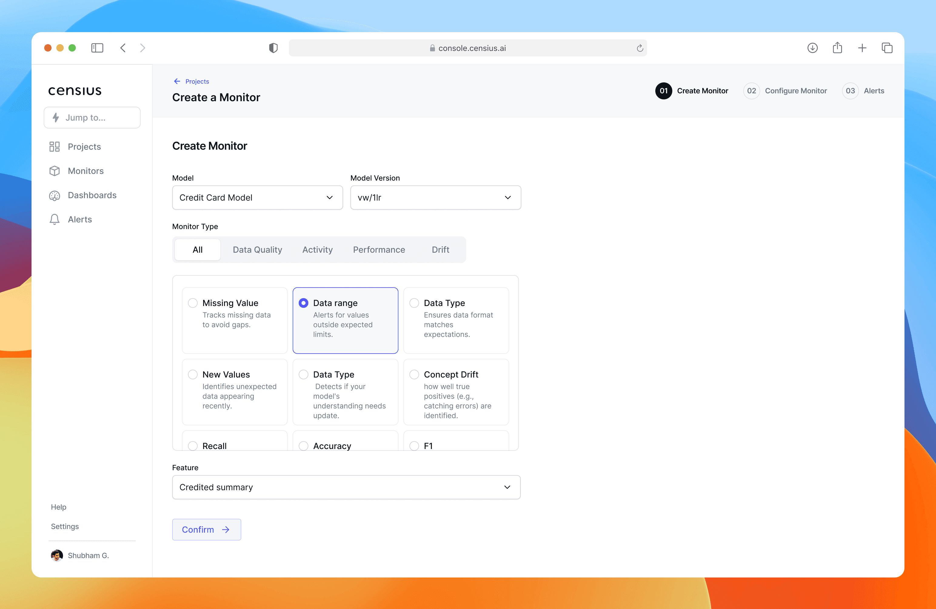
image: create monitor
In early wireframes, I explored multiple layouts, including placing form inputs on the right. However, usability patterns and scanning behavior research suggested that left-aligned form inputs are more natural for guiding users through sequential decisions.
I also tested two approaches for “Monitor Type with Dropdown – compact but hides options, reducing discoverability and Tabs with visual cards – larger footprint but makes capabilities instantly visible.
Design Decisions:
Chose left-aligned form inputs to match reading flow and reduce cognitive friction.
Replaced dropdown with tabbed navigation to reveal all monitor type categories (Data Quality, Activity, Performance, Drift).
Used descriptive cards for subtypes (e.g., Missing Value, Data Range, Concept Drift) so users learn as they choose.
Maintained clear hierarchy: choose high-level type → pick a specific feature → confirm.
Chose left-aligned form inputs to match reading flow and reduce cognitive friction.
Step 2 – Configure Monitor
The Configure Monitor step was one of the most complex interactions in the monitor creation flow because it’s where users define how their data is being tracked. The challenge was that this step needed to handle both simple one-off conditions and reusable, complex data rules without overwhelming the user.
From early team discussions, I learned that users—especially ML engineers—often set up very similar conditions repeatedly. In our initial tests, this repetitive setup quickly became a frustration point. I explored ways to reduce cognitive and manual effort without sacrificing flexibility.
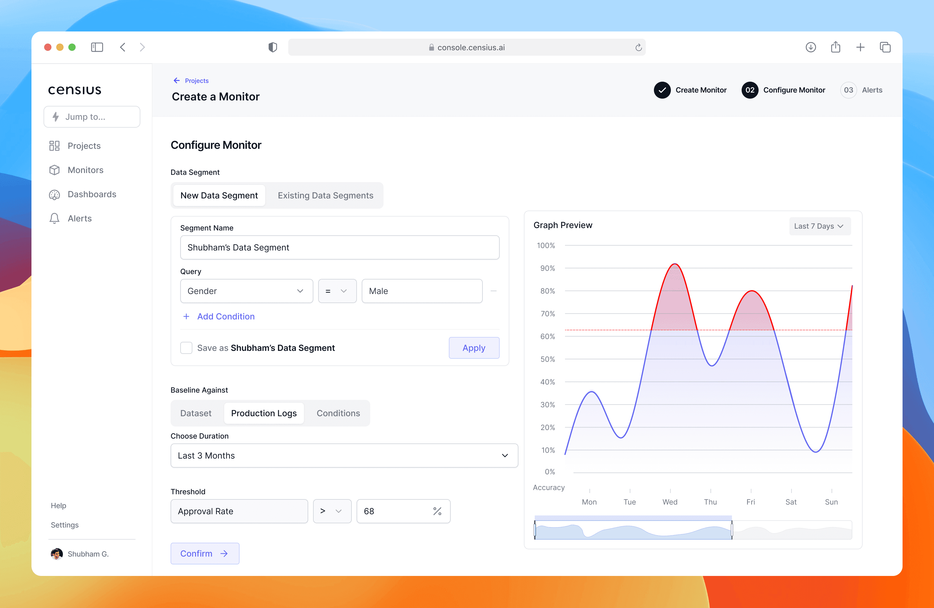
Step 2. Configure Monitor
Key design decisions:
Reusability through “Data Segments” – I introduced the concept of named, reusable conditions. Users could save a condition with a meaningful name and reapply it later in any monitor within the same project. This feature came directly from observing user pain during internal testing.
Switching between new and saved conditions – I added tabs at the top of the step to toggle between Create New and Choose Existing, allowing quick reuse without cluttering the main form.
Spatial layout for decision-making – I kept the configuration form left-aligned at a fixed 600px width, freeing space on the right for a real-time dynamic graph. The graph visualizes the baseline, threshold, and historical data—helping users make informed choices without leaving the page.
Impact: This layout and interaction model significantly reduced repetitive setup time while helping users make smarter, data-driven choices without leaving the page.
Step 3. Set up Alerts
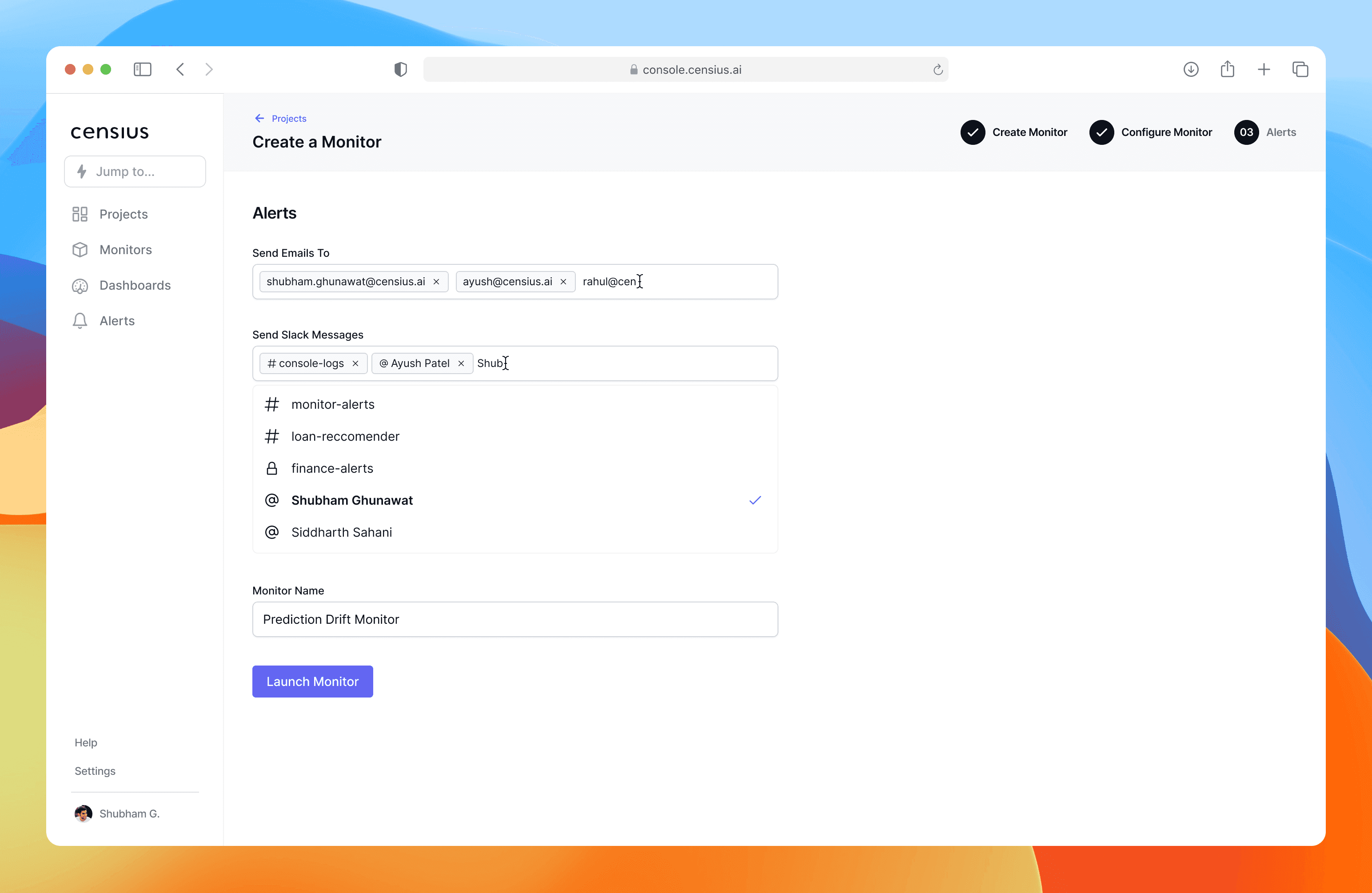
Step 3. Set up Alerts
The final step is where the monitor becomes actionable—deciding who should be alerted and how. From a UX perspective, I wanted this step to feel lightweight and conclusive, giving a sense of closure to the setup journey.
Key design decisions
Channel flexibility with minimal clutter – I used two dedicated multi-select inputs for Email and Slack, allowing users to quickly add one or multiple recipients without scrolling through long lists.
Clear mental model for completion – The page progressively builds from Who to notify → Name your monitor → Review & finish, matching a user’s natural mental model of finalizing a task.
Minimal distraction – Unlike earlier steps, this one avoids extra visuals or side data, focusing entirely on action completion.
By the end of this step, the user has a clear understanding that their monitor is ready to run and they can trust Censius to handle alerts as soon as violations occur.
Explain the why behind model's decisions.
When a model predicts something—like which customer should get a credit card upgrade—it rarely explains why. For most users, especially non-technical ones, this feels like a black box. If they can’t understand the reasoning, they can’t trust it.
My challenge: How do we give users visibility into why a model made a decision without overwhelming them with jargon and charts only a data scientist could love?
In AI explainability, there are two lenses for understanding model behavior:
Global Explainability – The big picture: which features influence predictions across the model overall.
Local Explainability – The zoom-in: how specific features influence a single prediction instance.
I wanted the UI to mirror the user’s natural thought process—start broad, then dig deeper—so I structured the screen into two collapsible sections: Global Explainability and Local Explainability.
Global Explainability – Understanding the Model as a Whole
Problem: Users needed to instantly distinguish between features the model is actually using vs. ignoring at any given time.
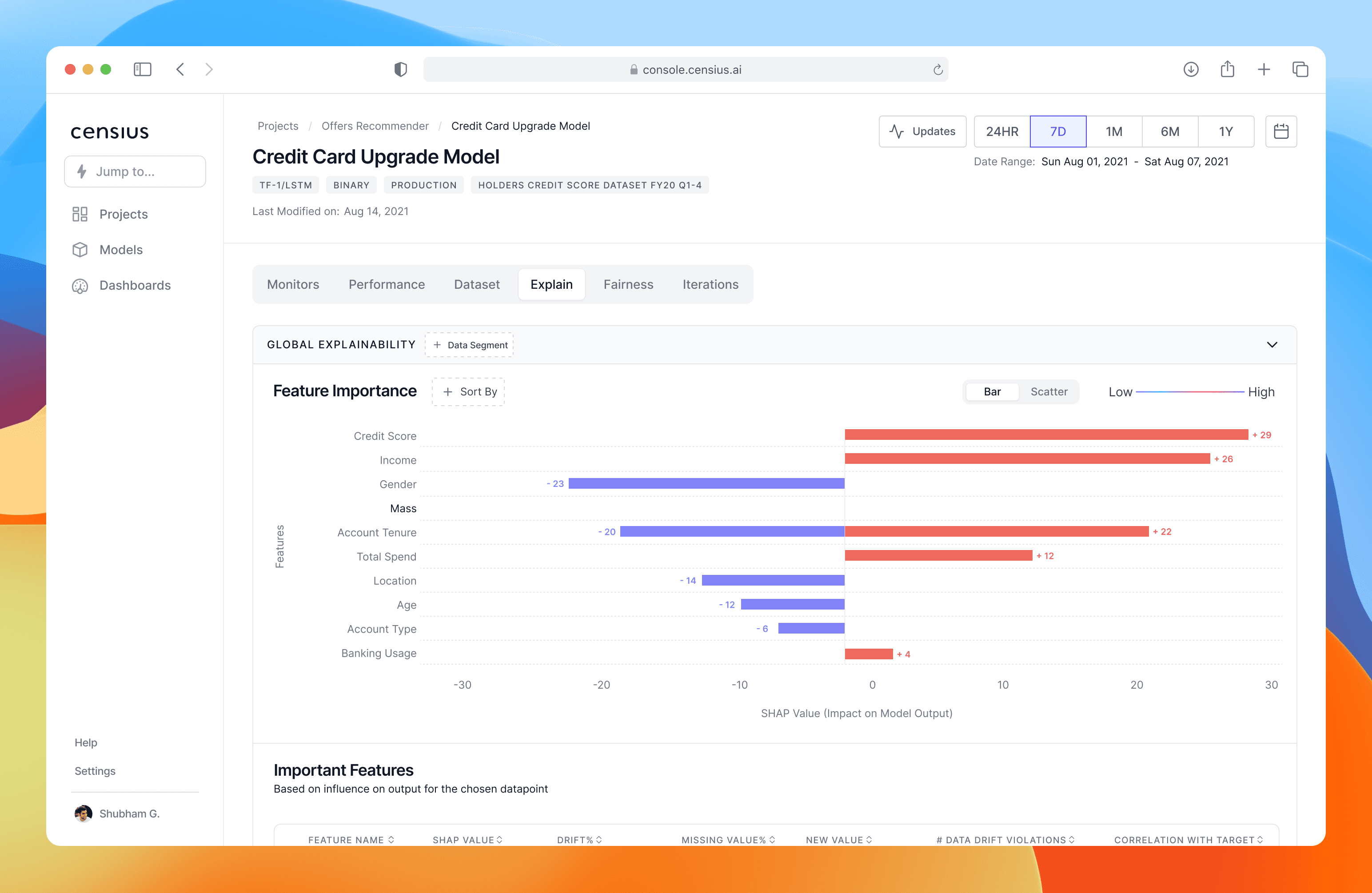
Global Explainability
Design Decision:
Use a dual-sided bar chart to immediately distinguish:
Blue bars → features the model isn’t currently using.
Red bars → features actively influencing predictions now.
A sortable/filterable table under the chart to let users drill into individual features without scanning through irrelevant data.
Impact:
Reduced “What should I look at first?” confusion.
Enabled analysts to spot changes in model behavior over time (e.g., credit score importance dropped last quarter).
Improved efficiency in root-cause analysis.
Local explainability
If global explainability answers “What matters overall?”, local explainability answers “Why this prediction for this case?”.
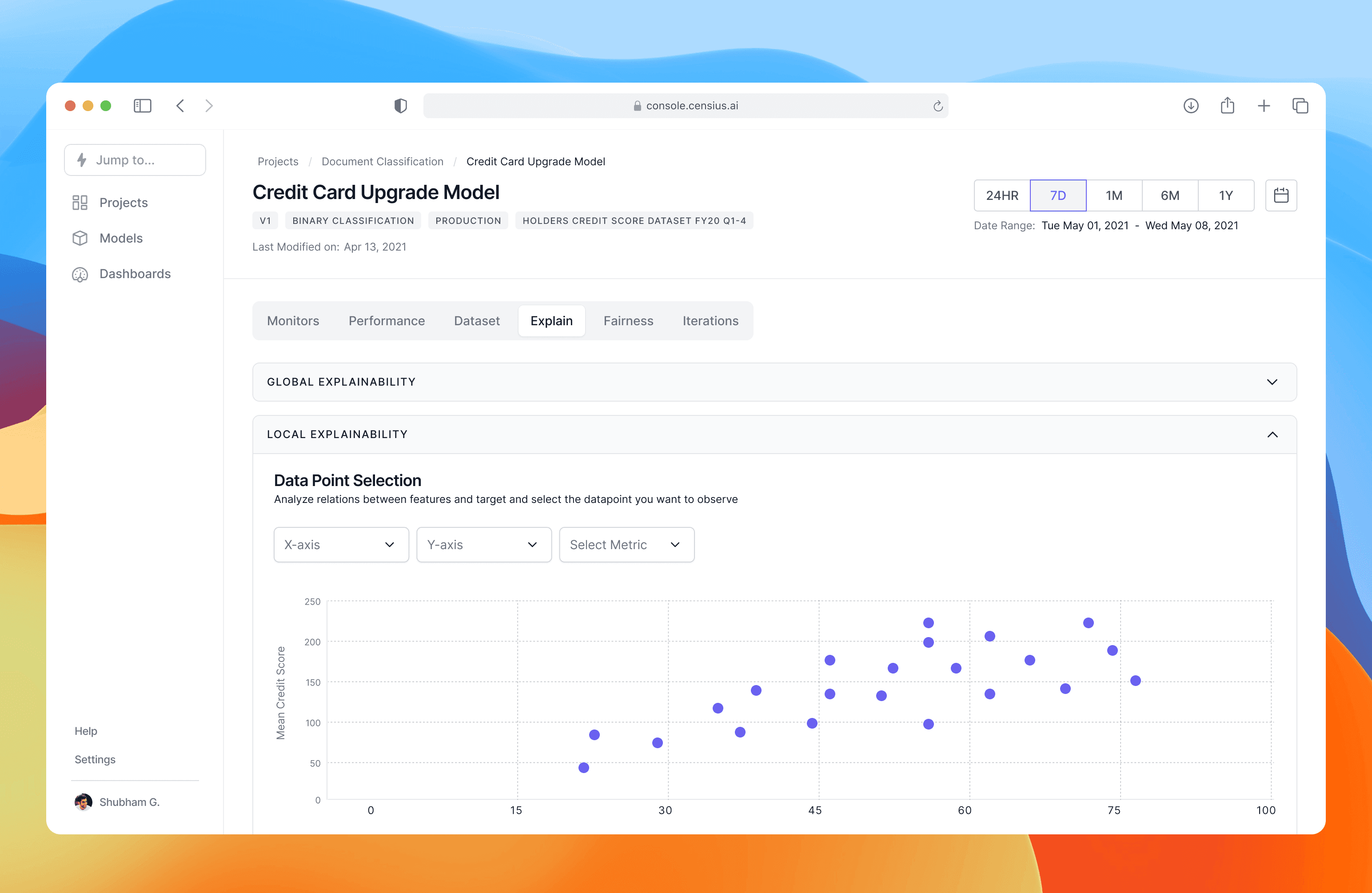
Local Explainability
Design Decision:
Interactive scatter plot: Users can pick any two features for the X/Y axis and see their historical relationship.
Causal clue hunting: By selecting a feature (e.g., “Total Spend”), the user can visualize its influence on one customer’s prediction.
Impact:
Analysts could explain a single decision with data-backed evidence.
Built trust among non-technical stakeholders who now saw why a call was made.
Increased adoption of model insights in business decision-making.