From Frustration to Fitness: How I Redesigned Lose It App
Lose It is a popular mobile app for tracking calories, setting weight goals, and staying motivated with workouts, recipes, and challenges. It guides users in setting a target weight and timeline, then creates a personalized daily calorie goal.
In this case study, I’ll share the process and design decisions behind my Lose It app redesign but before we do that let's have a quick sneak peek of before & after.
IMAGE: before and after lose it redesign
Why Redesign? Despite over 10M downloads, I found the app’s UI/UX lacking for its core weight loss goal. I saw an opportunity to improve the experience and used this redesign as both a challenge and a learning project.
Design Goals
📌
Improve Discoverability: Restructure navigation and layouts so core features—logging, challenges, exercises, communities—are accessible within fewer taps.
Reduce Cognitive Load: Simplify options, declutter screens, and organize information for instant comprehension.
Enhance Motivation: Integrate progress tracking, streaks, badges, and visual feedback to keep users engaged.
Support Quick Actions: Introduce shortcuts, search, and one-tap interactions to encourage frequent use.
Ensure Visual Consistency: Apply a unified style guide with consistent typography, iconography, and spacing across 75+ screens.
Enable Personalization: Give users control over their preferences, units, reminders, and goals for a tailored experience.
Let’s take deeper dive into the process
I started with hands‑on research: I used the app for several days, benchmarked competitor apps, and mined Play Store reviews to surface common pain points.
I mapped every screen into a Figma flow, annotated improvement opportunities, and sketched solution wireframes beside each screen. Finally, I prioritized issues by impact and feasibility to focus ideation and next steps.
Onboarding
Current Onboarding
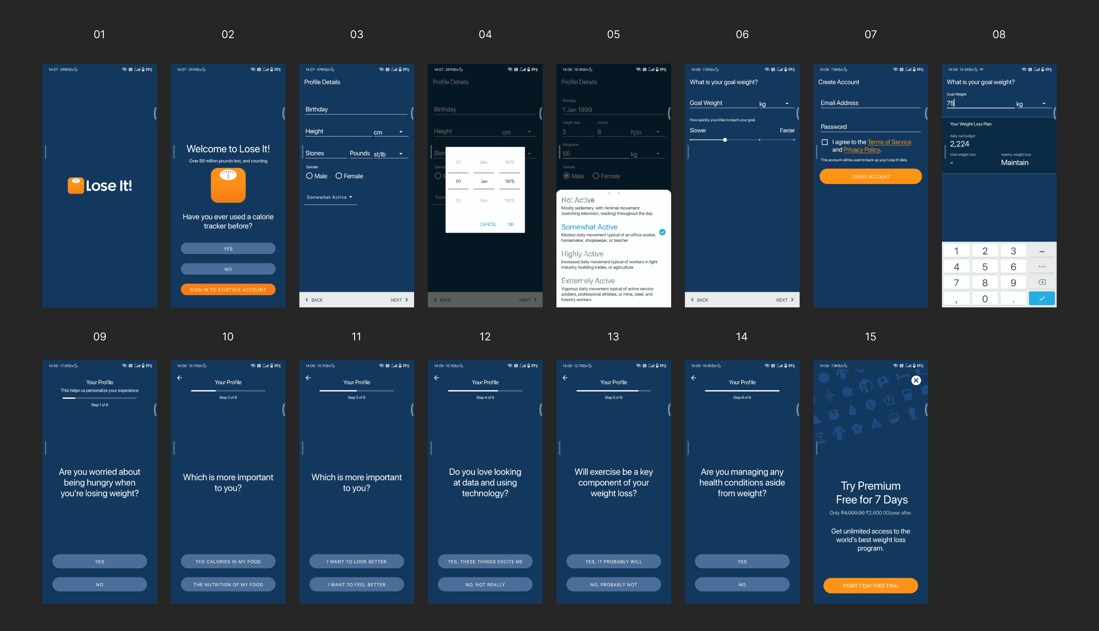
The app currently collects basic details, target weight, and timeline (Screens 01–08), followed by a recipe/workout preference survey. Pain points includes: too many screens, lengthy flow, and a survey that could be moved inside the app.
Redesigned Onboarding
I focused on making onboarding faster, more helpful, and easier to complete:
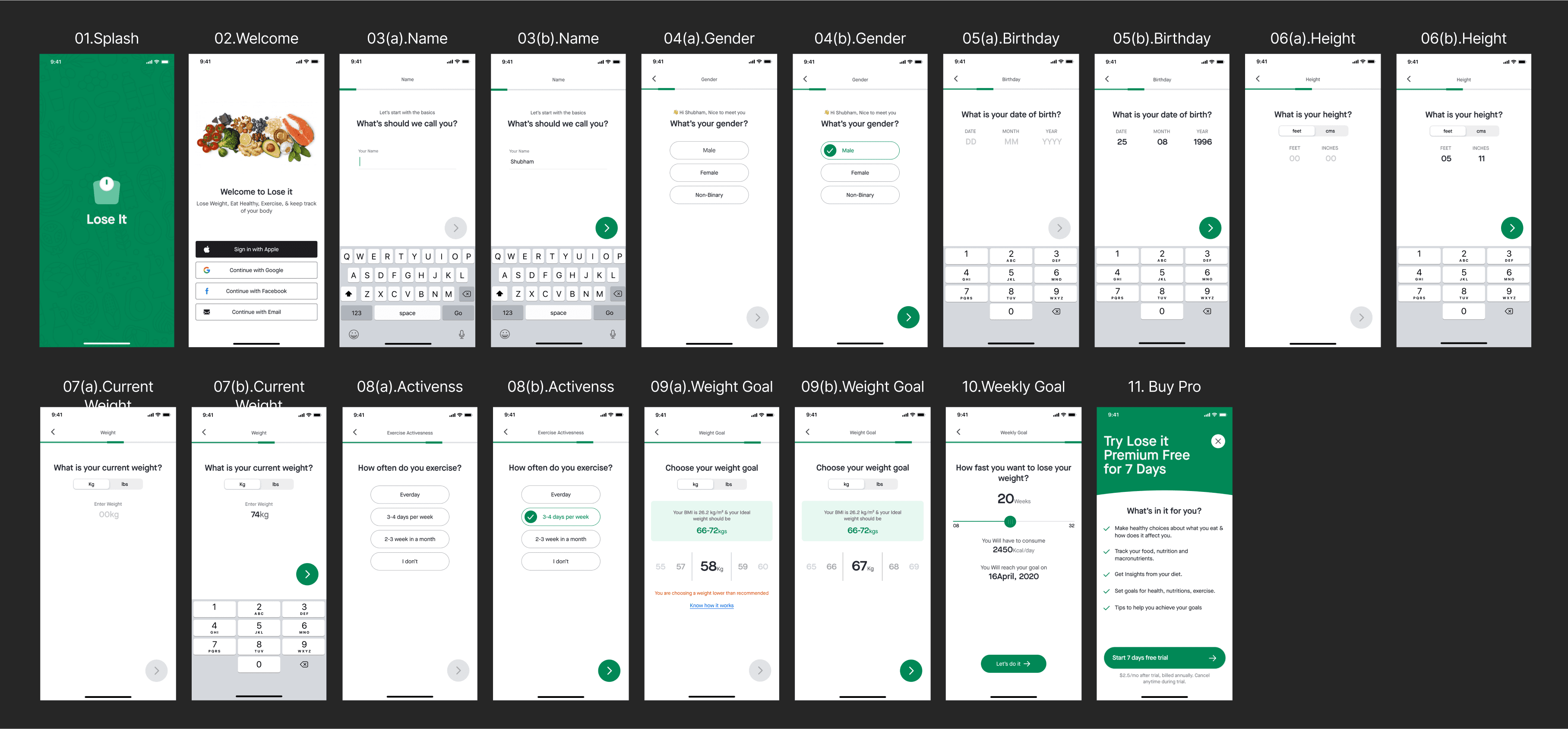
Added a BMI Calculator
Suggests a healthy target weight for users who aren’t sure how much to lose, using details already provided.
Asked One Question at a Time
Broke fields into conversational steps to reduce task perception and added sign-up via social accounts.
Integrated Survey
Moved the preference survey inside the app to shorten onboarding.
I added a progress bar to guide users through steps, showed the expected completion date on the Weekly Goal screen, optimized layouts for smaller devices like the iPhone 8 along with iPhone 12, and created multiple UI iterations with clear spacing guidelines (e.g., consistent “Next” button distance from the bottom).
Improving Content Visibility Through Navigation Redesign
In the original flow, the bottom navigation included My Day, Add, Goals, and Social, while Profile sat in the top navigation. Key features like recipes, exercises, and challenges were tucked under Profile, making them harder to discover—especially for premium users. In the redesign, I created a new Explore tab, bringing these features upfront. This change increases visibility, encourages users to explore more content, and makes premium offerings easier to access.
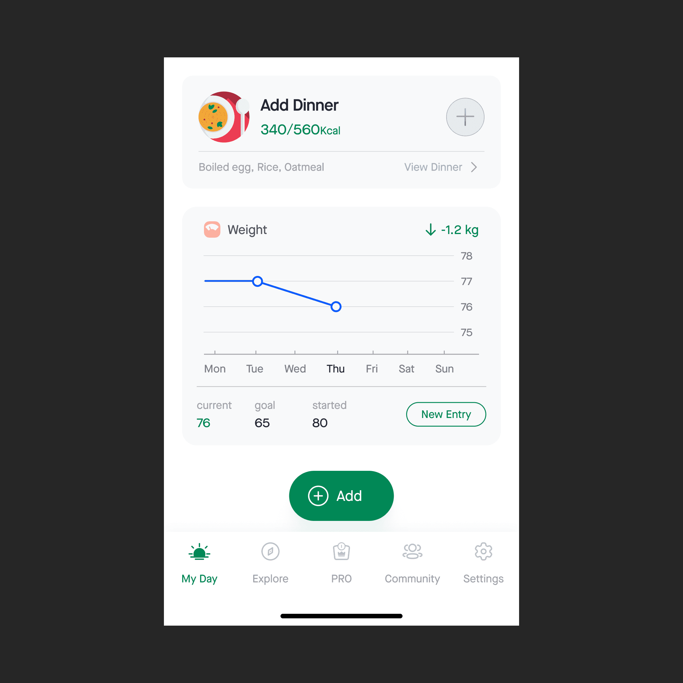
Home (My Day) — Redesigning for Clarity and Efficiency
In the original Home screen, key actions and insights were scattered, requiring multiple clicks to reach important features like logging food or checking detailed nutrition stats. My redesign aimed to centralize essential tools, reduce friction, and make daily tracking more intuitive.
Smart Date Picker – Replaced the old date navigation with a direct jump-to-date picker, enabling users to revisit or plan ahead in just one tap.
Top Right Quick Actions – The barcode scanner addresses a real-world use case: packaged food logging. Most packaged items (chocolates, snacks, drinks) already have barcodes, so scanning removes the manual search process entirely.
Main Calorie & Nutrition Card – Redesigned the primary card to present data in a cleaner, more digestible format with clear typography and spacing. Users can now tap “Details →” to open a nutrition breakdown view, segmented by day, week, or custom date range.
4. Integrated Tracking Cards – Logging essentials like food, activity, and water, which were previously buried under the “Log” tab, are now placed directly on the Home screen for faster daily access. Alongside them, I introduced a dedicated weight tracking card that visually charts the user’s progress over time, providing instant feedback and motivation.
Explore – Bringing Content to the Forefront
The new Explore tab consolidates the app’s most engaging premium features — Recipes, Exercises, and Challenges — into one easily accessible hub. Previously hidden under the profile section, these features are now just a single tap away, making discovery and engagement far more intuitive.
Recipes – Designed for Action and Clarity
The original recipe flow offered valuable content but lacked visual hierarchy and quick-scan readability. I reorganized the layout so users can quickly scan, identify key details, and make decisions without cognitive overload. Each recipe card now presents only the most actionable information at a glance:
Veg / Non-Veg glyph for dietary preferences
Calorie count for goal alignment
Cooking time for time-conscious users
Bookmark button for saving favorites
To further improve findability, I introduced:
Search with advanced filters (calories, cuisine, cooking time, meal type, recipe type)
Context Menu Preview (similar to iOS 3D Touch) for a quick peek at recipe details without navigating away
Nutritional breakdowns and share options to make healthy eating both informative and social
Exercises – Making Workouts Engaging and Easy to Find
The Exercises tab in the original app was functional but lacked visual appeal, discoverability, and user-friendly navigation. The layout felt static, with limited hierarchy, no search functionality, and minimal visual cues to guide users. For a feature meant to inspire activity, the experience itself felt uninspiring.
In the redesigned flow, the exercise list has been transformed into a visually engaging and information-rich interface (Image 1). Each exercise card now features:
Large, high-quality thumbnail images for instant visual recognition
Calories burn and estimated workout duration directly on the card, enabling informed decisions at a glance
To address the lack of findability, I added: A Search bar at the top for quick access to specific exercises and a optimized layout for easy scanning
Challenges – Motivation Through Better Habits
The existing challenges flow suffered from poor discoverability, cluttered UI, and a lack of clear value, making it less engaging and harder for users to take action. The redesigned flow addresses these issues through:
Browse & Search: Clean challenge list with a search option for quick access.
Active Challenges: Clear indicators for joined challenges, plus a “See All” button for multiple active challenges.
Details at a Glance: Summarized objectives, benefits, and timelines on the detail screen.
Community: Comment section for sharing experiences and motivation.
This approach makes challenges clear, actionable, and visually engaging, increasing the likelihood of participation.
Logging Food
Previously, logging a meal felt like a chore — too many options, cluttered layouts, and no quick way to add items. Users could log food via the PLUS icon in the bottom navigation or the LOG tab, but both paths involved multiple steps that slowed them down.
Simplified Categories: Cut the noise down to All, My Recipes, and My Meals.
Decluttered Layouts: Key info now pops with better spacing, clear typography, and visual hierarchy.
Intuitive Filters: Quickly sort by Most Recent, Most Frequent, or A–Z/Z–A.
One-Tap Add: PLUS icons beside items let you log instantly without opening extra screens.
Completion Feedback: A short success screen gives a satisfying “done” moment.
Single-Hand Friendly: Controls and CTAs placed for thumb reach, making logging doable on the go.
Community
In the current Social tab, too many features—Groups, Messages, Friends, and Activities—are crammed together, creating a cluttered and confusing experience. Navigation feels scattered, with overlapping tabs like Messages and Friends, while the Activities section feels unrelated to social interaction. Group management is buried under secondary actions, making it harder to join or discover new communities. Messaging lacks visual cues, and there’s no way to find local groups. Inconsistent card designs and poor visual hierarchy make the feed harder to scan, reducing the sense of engagement.
Redesigned Community Tab:
Three clear sections: My Feed, Groups, and Friends for simplified navigation.
My Feed: Personalized stream with distinct card styles for group vs. individual posts.
Groups:
All joined groups in one place.
Local group discovery (city, state, etc.) for nearby connections.
Clear “Join” and “Find Me” actions.
Friends: Unified friends list and messaging with Facebook sync for easy friend discovery.
Comment screen: Cleaner layout for readability.
Streamlined group search & join process.
Consistent iconography, typography, and visual hierarchy to reduce cognitive load.
Settings
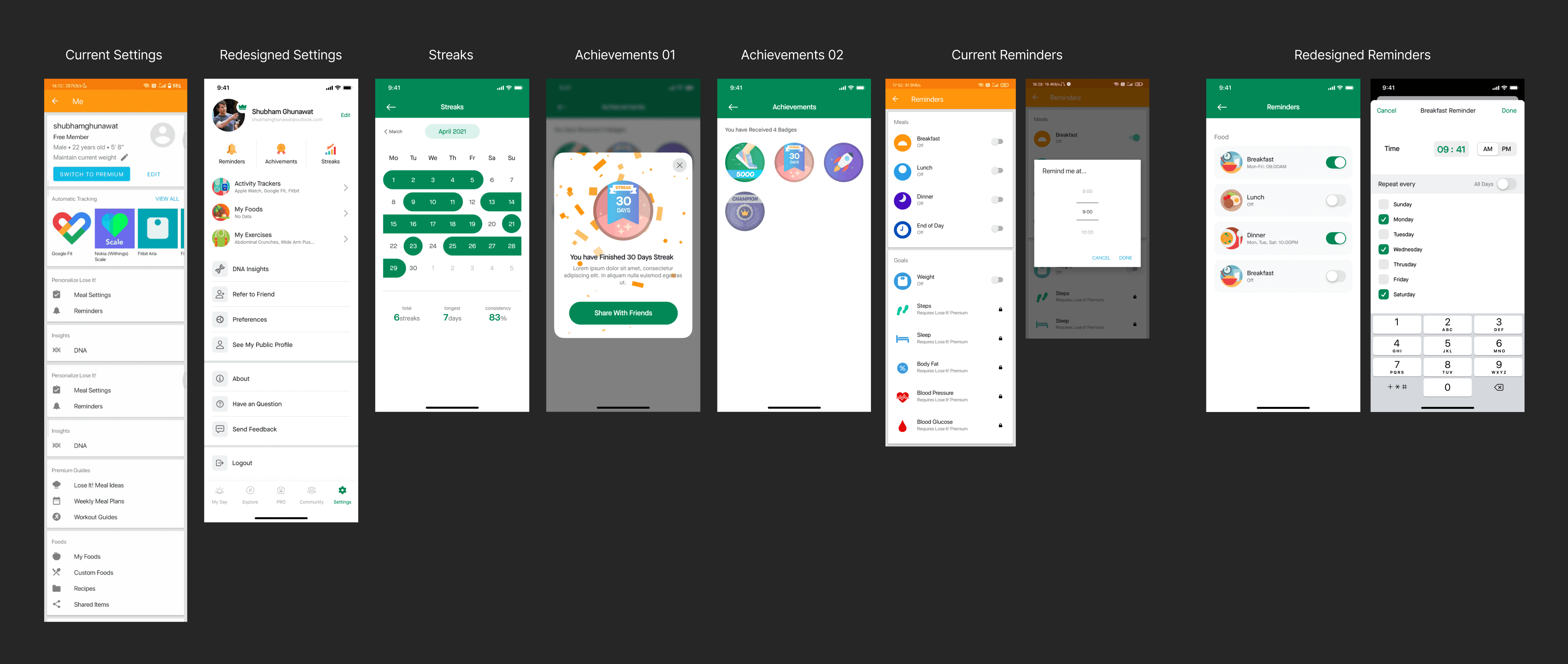
The Settings tab centralizes key personalization and tracking options. Users can:
Add their own food, recipes, or custom exercises.
Connect trackers like Google Fit, Fitbit, or Apple Watch.
Adjust unit preferences (kg, lbs, cm, etc.) for weight, height, and more.
View achievements and manage app preferences.
Enhancements in the redesign:
Improved visual hierarchy for faster scanning.
Added a Streaks screen to highlight consistency with goals.
Expanded gamification—badges for logging streaks, challenge completions, and long-term goals.
Upgraded reminders with a repeat feature, letting users choose specific days for notifications.
Style Guide
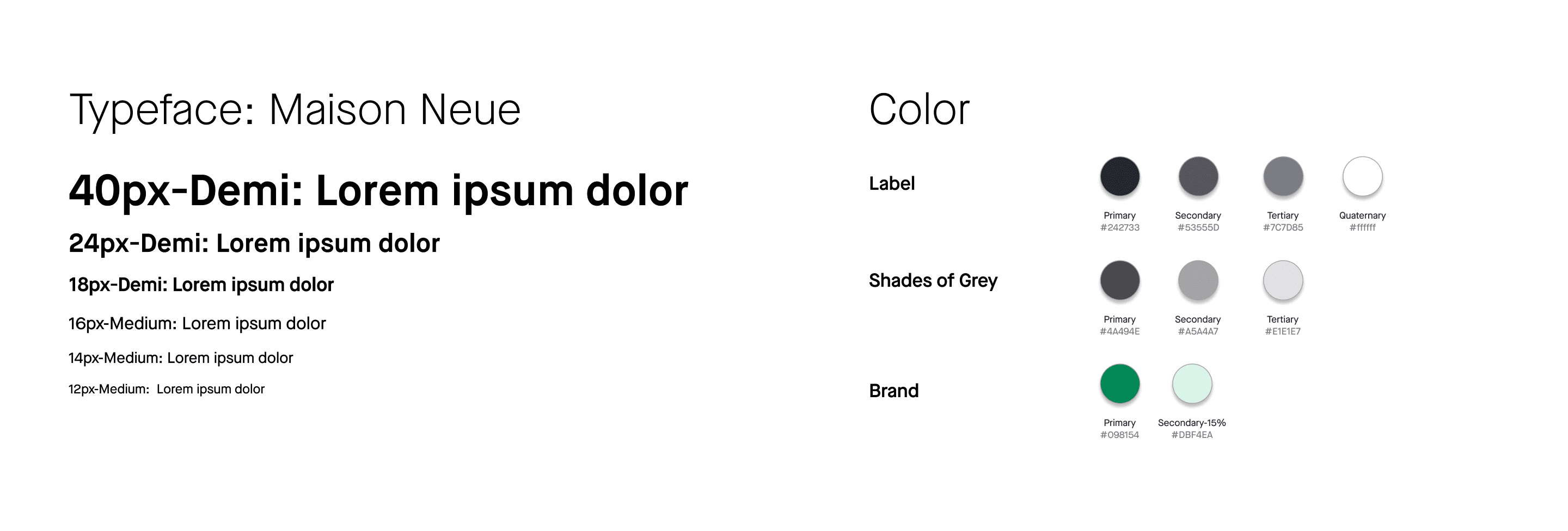
While refining the user experience, I also developed a rule-based visual design system covering typography, icons, and colors to ensure consistency across the app. Staying true to my love for minimalism, I kept the interface clean, modern, and easy on the eyes.
And the coolest part?
I designed 75+ screens using only six font sizes—a small but powerful decision that keeps the entire product visually harmonious.