Simplifying the Fight Against Fraud: A UX Overhaul for SHIELD's Platform


SHIELD is a device-first fraud intelligence platform that helps digital businesses eliminate fake accounts and prevent all types of fraudulent activities. SHIELD's platform is trusted and used by global companies like inDrive, Alibaba, Swiggy, and Meesho, helping them maintain trust and drive growth.
Let's understand it from an example from Swiggy, a leading Indian food delivery platform;
Swiggy Launches Referral Offer; Get rewards for every friend you refer.
🕵🏻♂️
Fraudster Creates Fake Accounts; Tries to claim bonuses with many fake signups from one device.
SHIELD Detects Device Abuse; detects multiple accounts being made from the same device.
✅
SHIELD blocks the fraudulent accounts; and helps Swiggy save money and clean data
SHIELD uses device-first fraud intelligence to uniquely identify devices, even if users change SIMs, emails, or use VPNs. Its core, SHIELD ID, creates a persistent device fingerprint. Combined with 20+ risk indicators—like GPS spoofing, proxy use, and app tampering—it helps detect and block fraud, even when disguised.
Problem
SHIELD provides device fingerprinting APIs used by companies to detect fraud and gain insight into user/device behavior. However, its legacy dashboard lags behind both in usability and aesthetics compared to modern competitors like Fingerprint. While the API is robust and widely adopted, customers often find the current dashboard unintuitive, visually outdated, and not supportive of fast, actionable insights.
Our primary users were fraud analysts and security experts who depended on the SHIELD dashboard to quickly identify suspicious activity and dig into potential fraud cases.
🎯
Business Goals
Increase Dashboard Adoption: Encourage more customers to use the dashboard alongside the API to analyze and act on device fingerprinting data.
Customer Retention and Engagement: Improve the dashboard experience by making important insights readily available, encouraging active fraud investigation, and offering continuous value beyond the core API offering in order to boost user engagement and customer retention.
Enable Faster Fraud Investigations: Speed up analyst workflows for spotting, tracing, and mitigating fraud events.
🪩
Design Goals
Improve Product Experience : Modern, branded visuals and intuitive navigation patterns—making it easy for users of all technical backgrounds to find, understand, and act on device and fraud-related information.
Surface Actionable, Transparent Data: Present key device fingerprinting insights and security events clearly, prioritizing the most relevant and trustworthy information while minimizing clutter and data noise to foster confidence and transparency.
Ensure Scalability and Consistency: Build with a maintainable component library and robust design system.
Role and responsibilities
Role
Sr. UI/UX Designer
Time
10 Months
Team
Jake Ooi (Product Head), Brian Hirai (Lead PD), Shubham, Nandita P. (PM), Jitendra P. (Front-end Lead), Anika Ahmed (TAM), +3 Front end devs.
Scope
Product Strategy, UI/UX/IxD, Prototyping, Design system
Status
🚀 Live
I led the design of key screens and defined the visual language across the dashboard. I built a scalable design system using MUI 5.1 and design tokens, ensuring consistency and efficiency. Throughout, I collaborated closely with developers—running handoffs, resolving edge cases, and maintaining alignment through weekly QA and sync sessions.
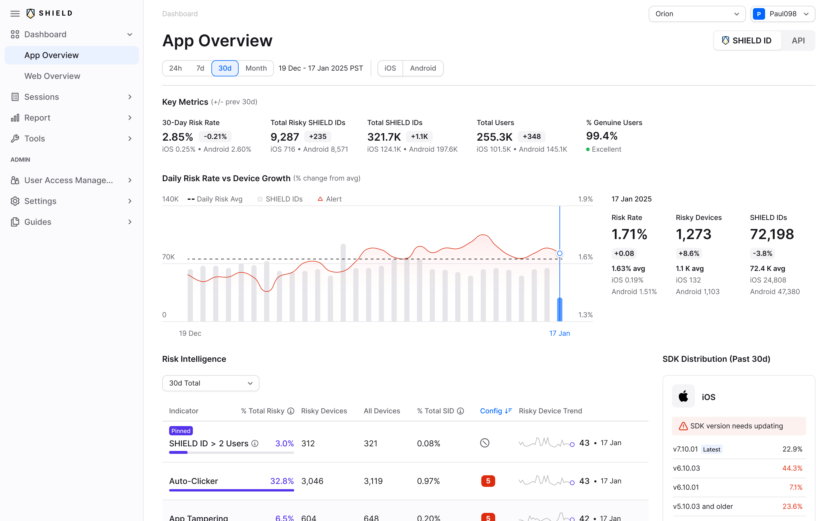
Structuring the Interface: Visual Hierarchy, Clarity & Consistency
video: overview
In Overview screen's revamp, we focused on creating a clear visual hierarchy with better typography and spacing, making the interface more intuitive to navigate. Data is now grouped with relevant context, helping users interpret insights faster. The layout makes better use of space, balancing density with readability reducing visual noise and making it easier to find what matters. Key risk signals are now more visible through purposeful use of color and iconography.
Enhancing Session Clarity for Faster Fraud Investigation
Image: before and After of session detail page
The redesign significantly improves cognitive clarity and storytelling around user session risk. It consolidates context by aligning user behavior, device activity, and associated identifiers into a single, well-scannable flow.
The Trust Score is visually emphasized with consistent color semantics, while labels like “SHIELD ≥ 2 Users” now stand out contextually—clarifying the reason behind risk attribution. Additionally, risk associations and linked identifiers are surfaced logically to support investigative reasoning, not just visual display.
The hierarchy of elements reflects typical analyst workflows—Session History > Risk Events > User Info—reducing cognitive jumps. Subtle enhancements like de-emphasizing raw IPs and prioritizing actionable groupings (e.g. number of users sharing a device) further show product thinking beyond surface UI.
Not Everything Made the Cut — Session Detail Page Iterations
Designing Clearer Workflows for Flagged User Management
video: blocklist/allowlist
Flowchart: user journey of blocklist/allowlist
I redesigned the Blocklist / Allowlist screens to make it more intuitive and audit-friendly for internal teams managing flagged users. The new design introduces clear separation between the two lists, improves readability with a clean table layout, and adds useful context like timestamps, admin names, and comments for better traceability. I also incorporated search and pagination to handle large data sets efficiently. The goal was to help fraud teams act quickly and confidently during investigations.
Rethinking Account Creation: Logic, Clarity & Trust

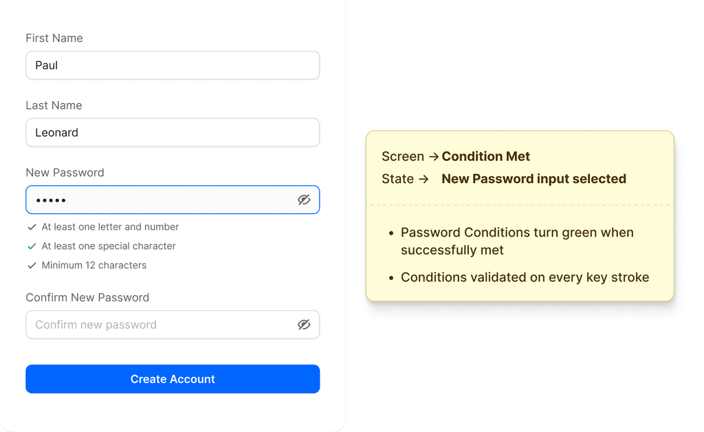
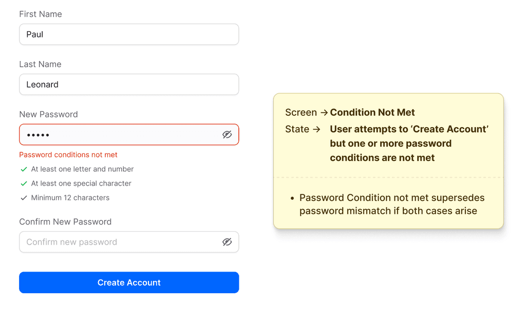
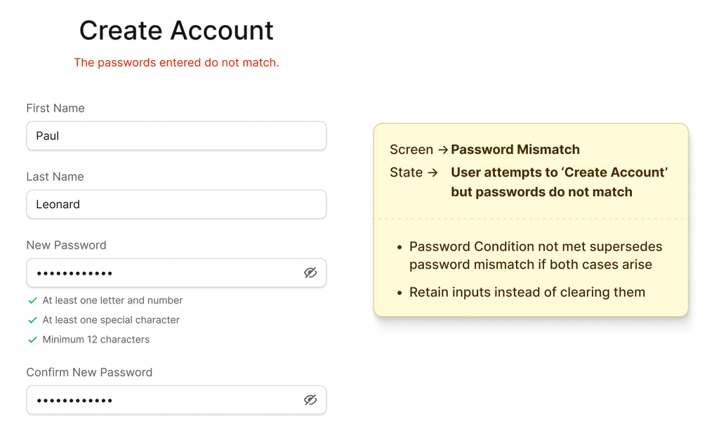


A few example for Validation feedback, Input field visibility toggles and improvements
While the existing sign-up/login flow was functionally adequate, it lacked refinement in logic and overall UX behavior. I led a detailed visual and interaction-level revamp to address these gaps—introducing clearer password validation logic, more intuitive feedback, and consistent visibility toggles across inputs. These enhancements not only polished the experience but also made key micro-interactions more accessible, secure, and user-friendly.
Bridging Design and Dev: Clear Handoffs & Collaboration
Documentation Example: Risk Config and calendar component
For documentation and handoff, I made sure each design screen was thoroughly annotated with clear, contextual notes outlining logic, edge cases, and expected behaviors. Every interaction had accompanying written explanations to reduce ambiguity for developers. I maintained regular check-ins with the engineering team, conducted weekly syncs to align on progress, and joined stakeholder calls to clarify use cases and unblock decision-making. This helped bridge any communication gaps early, ensuring the final implementation stayed faithful to the design intent.
Outcome
Using Mixpanel and PostHog, we started actively monitoring user interactions after launching the updated SHIELD dashboard in Q4 2024. Based on reviews and feedback, we gradually pushed out additional screens and flows and made a number of improvements in Q1 2025.
The information and impact described below are based on our observations and analysis from Q2 2025.
30%
Increased dashboard adoption by 30% as more customers engaged with the redesigned interface alongside the API.
1.7x
Increment in average session duration.
25%
Reduced front-end development time after establishing a scalable design system and Luna component library.
Building a Scalable Design System - Luna
When I started, our component library, it was really a patchwork—outdated MUI components scattered between Storybook and Figma, rarely matching in style or function. Building our real system, which we called Luna, took time and teamwork: I mapped what we had, rebuilt core components in Figma to faithfully match our MUI code, and created a unified set of design tokens so designers and developers finally spoke the same language. Week by week, we synced components, closed gaps, and thoroughly documented everything.
At the start, our focus with tokens was intentionally narrow—we targeted colors first. With so much inconsistency across the old dashboard, even simple things like button or alert colors were a mess. By standardizing color tokens in Figma and syncing them directly with our MUI codebase, we created one reliable palette that everyone could reference. This alone instantly cleaned up the interface and made it much easier for developers to implement designs quickly and accurately.
Although implementing a dark theme wasn’t part of our initial scope, the structured token system made it an easy extension. By following consistent naming conventions and aligning tokens with MUI’s theming architecture, we were able to introduce dark mode values without major refactoring.
Explore More Work

© Shubham 2025